Sign Systems: Rejuvenating St. Michael’s Hospital
by all | 1 August 2014 1:30 pm
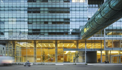 [1]
[1]Photo by Tom Arban
By Peter Saunders
St. Michael’s Hospital in downtown Toronto has been in expansion mode over the past few years, opening a new wing and adding an entirely new building, which has meant a need for new signage, including wayfinding and donor recognition systems. As these elements have been added, they have created something of a template for further expansions to come.
The Donnelly Wing, for example, represents the rebranding of the hospital’s former Queen Wing (named after the adjacent Queen Street) following a donation by philanthropist Terrence Donnelly, which provided the opportunity to develop a new style guide for wayfinding signs.
The Li Ka Shing Knowledge Institute, meanwhile, is designed to bring clinicians, educators and researchers together to develop best practices and accelerate the delivery of new services to patients. Initially conceptualized as a research centre, but then growing to a massive scale, it required a new, centralized strategy for donor recognition.
In both cases, the sign manufacturer’s role was more like that of a strategic consultant than an off-site supplier.
“Dialogue with both architects and clients has become part of the process of producing and rolling out signage,” says Keith Francis, vice-president (VP) of strategic planning and business development for Acumen Visual Group in Markham, Ont., which has worked with the hospital on these and other projects. “It used to be the case that sign fabricators were not part of those discussions, but now we are involved earlier on in the process to translate two-dimensional (2-D) drawings into three-dimensional (3-D) reality. With St. Michael’s, our voice was heard and design mandates were changed.”
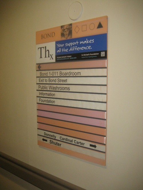 [2]
[2]The older signs were designed to be updated periodically with printed inserts, but some were never refreshed and others inconsistently.
A history of growth
St. Michael’s Hospital was founded in 1892 by the Sisters of St. Joseph. As a teaching and research hospital serving the inner city, it established Canada’s first Catholic nursing school. When it opened, the facility had 26 beds, six doctors and four graduate nurses.
By 1912, St. Michael’s had grown to encompass 300 beds across two large wards, one of Toronto’s first X-ray machines, an emergency department, a five-room operating suite and a nursing school. A formal agreement to receive students from the University of Toronto’s (U of T’s) faculty of medicine was negotiated in 1920 and continues today.
The hospital now serves as downtown Toronto’s adult trauma centre and one of Ontario’s major care facilities for critically ill patients. With 467 acute adult inpatient beds, 720 physicians, 1,760 nurses, 5,741 staff members and 538 volunteers spread across nearly two million square feet of property, it has become a hub for complex cardiac and cardiovascular care, minimally invasive surgery, diabetes and osteoporosis care, neurosurgery and care for the homeless and disadvantaged.
Donnelly Wing
When the Queen Wing—the largest of the hospital’s four wings—was renamed after Terrence Donnelly, new wayfinding signage was needed throughout.
The existing signs had been installed in 1998. They were designed to be updated periodically as needed with printed inserts, but the hospital had not dedicated any staff to this task over the years. As such, some signs had never been refreshed, while others were updated inconsistently, e.g. indicating ‘X-ray’, ‘scanning’ and ‘imaging,’ which all referred to the same department.
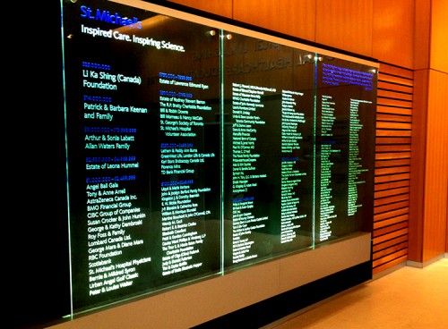 [3]
[3]Two large-format donor recognition glass panels were produced, one for each of the new building’s lobbies. Photo courtesy Acumen Visual Group
“When I joined St. Michael’s in 2012, wayfinding had been neglected for so long, some of those old signs were falling apart,” says Josh O’Neil, project co-ordinator. “The printer used for the inserts didn’t even work anymore. We pulled people from different departments together to form a wayfinding committee. By following best practices, including a consistent hierarchy of listed information, we were able to give the other staff a template so all directions given to visitors are the same.”
The hospital commissioned Toronto-based registered graphic designer (RGD) Elsa Yuen, founder of What El’s Idea, to create a guide and message schedule and design the signs. Her drawings were then sent to Acumen for fabrication.
“Different colour standards were established for the different wings,” says O’Neil. “The Donnelly Wing would use green throughout.”
As this was a ‘live’ and very busy environment, not a new buildout, it was not easy to remove the old signs and put up Yuen’s new ones.
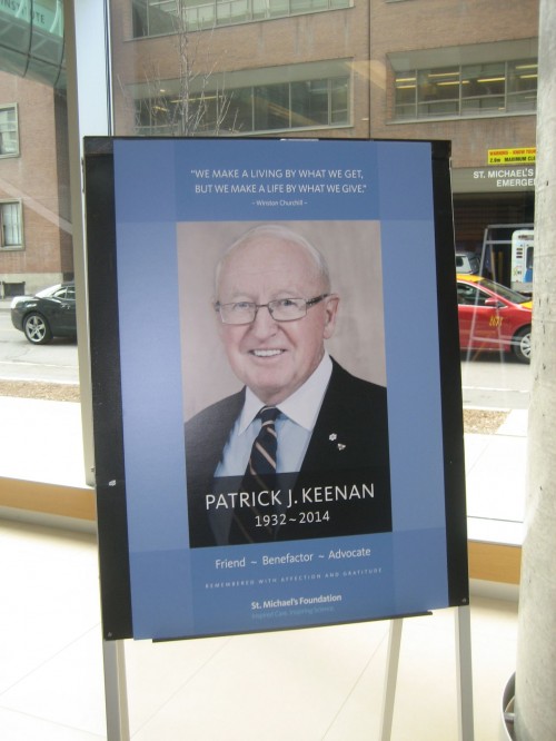 [4]
[4]Longtime donor Patrick J. Keenan, who recently passed away, is honoured in the lobby. Photo by Peter Saunders
“The sign removal was the most challenging part of this project, requiring a lot of patching and painting,” says Taso Tsoutsos, president of Acumen. “We went in after-hours and put up temporary signs while we were still finishing the sanding and painting of the walls. It took a few weeks. Then, as the patching was removed, we would go in and install the new permanent signs.”
“There were definitely issues with the paint and it took a lot of touch-ups to match colours around the signs,” says O’Neil.
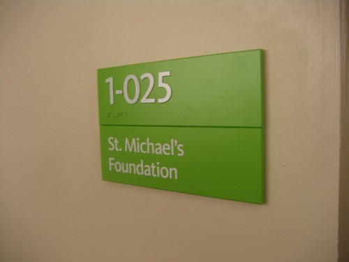
Besides renaming the wing and establishing a common colour theme, one of the main reasons for the new system was to add braille dots and tactile characters.
“We specified photopolymer braille for durability,” says Tsoutsos.
In total, the system comprised some 762 signs, including 540 wall-mounted room identification (ID) signs, overhead directional signs, large-format directories with ‘you are here’ maps, restricted access designations and digitally printed floor graphics, which particularly help point visitors in the right direction.
Li Ka Shing Knowledge Institute
Meanwhile, a long-planned expansion of the hospital was coming to fruition.
“We had been developing programs with U of T and needed to build a consolidated space for them,” explains Kelly Henderson, the hospital’s redevelopment manager. “While we had the original research centre concept back in 1999, the idea of a full educational centre came along and we wanted to shorten the time between a discovery and when it can help a patient.”
 [5]
[5]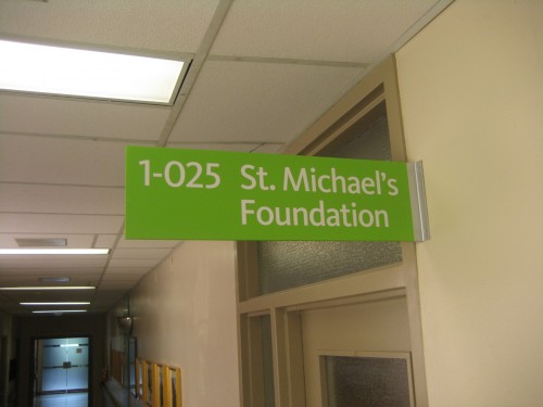 [6] The new signs are made with photopolymers, which support the addition of braille and other tactile elements where appropriate.
Business magnate Li Ka Shing’s foundation had already funded health-care knowledge institutes in the U.S., U.K. and China when it became the major international donor to the new St. Michael’s building. The major local donor was the Keenan family, which had been involved in the project since earlier in its development.
“A strategy was needed to recognize both of these donors in the right ways,” says Henderson. “The Keenan Research Centre would be part of the Li Ka Shing Institute.”
The building was named in 2006 and built starting in 2007. The broader fundraising campaign continued well into the construction period.
“We didn’t really know our signage requirements until the campaign was almost done,” says Henderson. “It was like a planned-out afterthought.”
So, as construction neared completion in 2010, Acumen was commissioned to fabricate all donor recognition elements, including exterior signs, engraved plaques and infilled panels, based on drawings by Hahn Smith Design.
“They called us in to speak with the donor committee and then we had about two months from that meeting to complete a tremendous quantity of signage,” says Tsoutsos. “There was a lot of urgency. We made sure we had a dedicated team to work with. There were big drawings and panels to be engineered, but with that level of co-operation, we were able to make it happen efficiently. It was a real team effort.”
The donor recognition system encompasses aluminum lettering, plaques and large-format glass panels, one for each of two lobbies. Donors of more than $1 million were represented with cut, raised brushed-aluminum letters. Those below $1 million were etched into the panels instead.
As the campaign continued and updates rolled in, however, there was no way to build permanent signage for all donors in time for the building’s grand opening in 2011. Instead, Acumen sprayed foam-core lettering with silver paint to serve as a temporary placeholder.
“We had a few temporary plaques up for the opening event, but most were the permanent ones,” says Tsoutsos.
“Acumen saved the day,” says Henderson. “They met our ever-changing timelines and we had a great working relationship with them on a daily basis. And as the redevelopment of St. Michael’s continues, there will be new donor recognition signs to come.”
With files from Acumen Visual Group and St. Michael’s Hospital. For more information, visit www.ideasbuilt.ca[7] and www.stmichaelshospital.com[8].
- [Image]: http://www.signmedia.ca/wp-content/uploads/2014/07/Li-Ka-Shing-34.jpg
- [Image]: http://www.signmedia.ca/wp-content/uploads/2014/07/IMG_7973.jpg
- [Image]: http://www.signmedia.ca/wp-content/uploads/2014/07/4.jpg
- [Image]: http://www.signmedia.ca/wp-content/uploads/2014/07/IMG_7994.jpg
- [Image]: http://www.signmedia.ca/wp-content/uploads/2014/07/IMG_7968.jpg
- [Image]: http://www.signmedia.ca/wp-content/uploads/2014/07/IMG_7967.jpg
- www.ideasbuilt.ca: http://www.ideasbuilt.ca
- www.stmichaelshospital.com: http://www.stmichaelshospital.com
Source URL: https://www.signmedia.ca/sign-systems-rejuvenating-st-michaels-hospital/