Stamping a mark on historic Niagara Falls
by | 24 August 2021 10:17 am

A Niagara Falls, Ont., mural inspired by the city’s history was completed in just four weeks, ultimately winning first place in the Historical Sign category at the 2020 Best of Canada’s Sign Industry Awards (BOCSIes).
By Elaine Wallis
An award-winning mural in Niagara Falls[1], Ont., began with a look at the city’s history—and how it intersects with the present.
Having led the production and design of 11 murals throughout Canada, the United States, and Greece over the past 30 years, this article’s author was finally presented with the opportunity to paint a mural in her own town in fall of 2019. The City of Niagara Falls Downtown Arts & Culture Committee[2] came forward in September of that year, offering funding and a blank wall in exchange for an engaging mural. However, the project had to be completed by the end of October.
This posed a challenge, as mural projects typically take months to iron out. They incorporate numerous steps—including design briefing, research, rough sketches, vetting of ideas through committees, and creation of a scale maquette—in addition to approximately one week of painting.
With just four weeks’ lead time and free rein on the mural’s subject, size, and production, it was essential for work on the project to begin immediately.
The idea
The concept for the project stemmed from a desire to explore the history of downtown Queen Street from the perspective of both the local community and the travellers who visit the famous tourist attraction of Niagara Falls[3]. It evolved with the realization every postcard, letter, and package that arrived in or left Niagara Falls had to make its way down Queen Street to the post office.
After initially considering a vintage postcard as the mural’s subject, the author found inspiration with the discovery of a photo of a 20-cent Canada Post stamp from 1935, which features Niagara Falls. The stamp features the number 20 on each bottom corner, making 2020 a seemingly ideal time to transform it into public art.
According to Postal History Corner, in 1935, a 20-cent stamp would only be used on a parcel.1 The mural concept developed as this sparked questions about what kinds of parcels people would have mailed at that time and what letters would have accompanied them. Each parcel would tell a story, especially because 1935 was the height of the Great Depression.
With this history in mind, the author created fictitious letters, which were used to fill the etching lines in the sky and the water below the falls. This added an element of curiosity that would draw the viewer closer, pass on some history, and start a conversation.
The production
With a short deadline and potentially difficult October weather to contend with, it was decided the mural would not be painted directly on the wall. However, painting needed to begin immediately to accommodate the tight timeline. Measurements were taken, and it was determined a 2.5 x 3.7-m (8 x 12-ft) mural would fit nicely in the allotted space. Fabricators glued three white, 6-mm (0.2-in.) aluminum composite panels (ACPs) onto an EX-7 frame using two-part epoxy and constructed a lightweight aluminum subframe that would later be installed onto the wall. This simple retrofit system is effective for non-illuminated wall signs, as it looks clean with no visible fasteners.
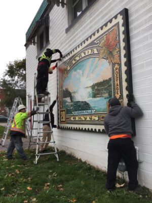
The installation.
The mural panel was temporarily installed on a wall in the author’s shop to make it easy to work on. The surface of the white ACPs was sanded with a scouring pad to remove the slippery, glossy finish and enable better paint adhesion.
Paint selection also had to be carefully considered. The paint employed for the mural had to be both quick to dry and durable, designed for long-lasting exterior applications. An acrylic paint was chosen because it fulfilled these requirements, as well as providing vibrant transparent and opaque colours.
Finally, a high-resolution stock photo of the original stamp was purchased. Two black-and-white photocopies of the stamp image were made onto clear 215 x 279-mm (8.5 x 11-in.) film sheets. One film sheet was used to create the colourized maquette by simply painting on the reverse side using a palette of vintage colours mixed with the acrylic paints.
The other film sheet was employed to project the stamp onto the wall panel using an old overhead projector. From there, the linework was traced using black permanent markers. These work well because they are waterproof and because the black lines bleed through paint, allowing artists to stay true to the original image. The marker lines also fade away in the sun quickly.
A water-soluble pencil was utilized to lightly trace in the etched lines in the water below the falls and in the sky, as a guide for placement of the permanent lettering. The letters were far too small to hand letter with a brush, so fade- and ultraviolet (UV)-resistant markers were used instead. Ideally, the marker-drawn letters would last, and the worst-case scenario would be they would eventually disappear—just as time and history fade away.
The mural’s colour palette was inspired by vintage postcards. Acrylic artist brushes were employed to quickly paint in washes of colour for the leaves, water, and sky. The solid black linework followed to clean everything up. The painting process took approximately one week, and the mural was installed before the end of the month. As a finishing touch, the author went onsite and painted the cancelled postage marks across the mural and onto the wall.
The result
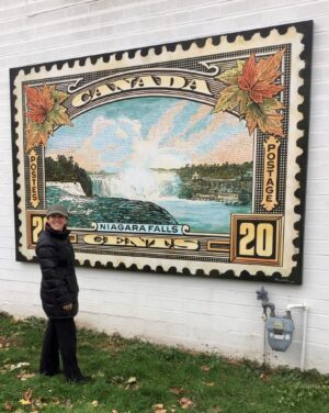
Elaine with mural on wall.
Since its installation, the mural’s marker-drawn letters have almost entirely faded. Recently, the mural itself was relocated to another building on the same street, at which point the letters were added back in on wall panels alongside it. The wall the mural was moved to was stucco on foam, so the subframe required longer bolts: 8-mm (0.3-in.) butterfly clips with 152-mm (6-in.) long 8-mm bolts. Given the fact the mural was not painted directly on the wall, it was able to be saved when relocation became necessary.
The mural earned first place at the 2020 Best of Canada’s Sign Industry Awards (BOCSIes) in the Historical Sign category.
The piece remains on Queen Street, offering an engaging look back at Niagara Falls’ history.
Elaine Wallis is the principal designer and founding partner of Signature Sign & Image in Niagara Falls, Ont. She and her husband Jeff started what is now a family business from the basement of their home in 1983. The company produces all types of signs and displays, with a focus on electric and digital signage. Wallis is also a member of Walldogs, an international organization of muralists. She can be reached via e-mail at elaine@signaturesigns.ca.
Notes
1 For more information, visit postalhistorycorner.blogspot.com.
- Niagara Falls: https://niagarafalls.ca/
- City of Niagara Falls Downtown Arts & Culture Committee: https://niagarafalls.ca/city-hall/committees/arts-and-culture/default.aspx
- Niagara Falls: https://www.signmedia.ca/publications/de/202011?page=23
Source URL: https://www.signmedia.ca/stamping-a-mark-on-historic-niagara-falls/