
Lancôme
French cosmetics house Lancôme promoted its new fragrance, La Vie Est Belle, in North America with an advertising campaign strategy that translated its name into English: ‘Life is Beautiful.’
A dominant backdrop visual of movie star Julia Roberts, the company’s ‘global ambassador’ and face of the fragrance, was mounted behind a clear acrylic panel counter and showcase tower in Sears department stores. The resulting display simulated cosmetics counter space solely devoted to the single product.
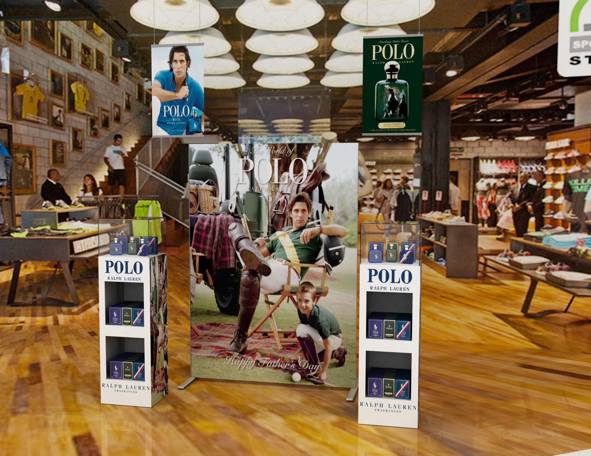
Ralph Lauren has used a combination of banners, posters and product showcases to promote its Polo fragrance.
Aeroméxico
When carrier airline Aeroméxico wanted an oversized display medium to advertise its on-time boarding, the company turned to information ‘totems’ that would tower above passengers’ heads, allowing an unobstructed view of the messaging.
Despite their height, the totems offered a small footprint and low weight, which made them easy to move from location to location. Snap-on panels allowed the messaging to be changed out as desired.
Viktor & Rolf
A Christmas display was recently designed to invite customers to step inside the house of Viktor & Rolf, a Dutch fashion company. The brand’s signature pink and grey colours were used extensively, representing female and male fragrances, with a mixture of hard and soft shapes and textures, ranging from high-gloss prints to acrylic to aluminum.
The display conveyed different stories for different products. Pink boxes with black ribbons appeared to be descending from the chimney as special gifts from Santa Claus, for example, landing at the bottom of a fireplace. One side was heavy with grey to devote space to the Spicebomb fragrance for men. On the other side, pink was used for the more modern, feminine, high-fashion Flowerbomb fragrance.
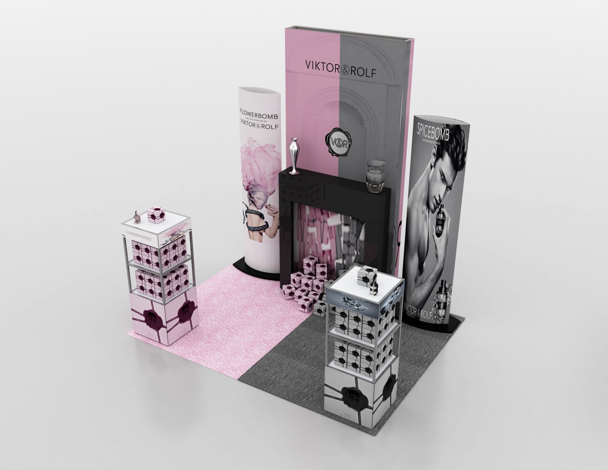
Viktor & Rolf used pink and grey graphic panels to showcase fragrances for women and men, respectively.
Flame-retardant fabric graphic panels were attached with Velcro to a lightweight, portable, stand-alone ‘wall’ frame, with magnetic locks snapping the structure into place. The pink and grey branding of these panels provided a backdrop for the black fireplace and decorative vases.
On either side of the fireplace and fabric wall, cylindrical banner stands featured complementary graphics, again targeting different groups for each fragrance.
To further define the display space, two merchandising shelving units were set up to house the products. These units used snap-on panels at the top and bottom, offering consistency throughout the display structure while allowing the flexibility to showcase different messages as appropriate to each fragrance.
An alternative path
In these ways, visual display systems are meeting the needs of highly visually oriented clients, including those who want custom-designed and fabricated projects as alternatives to off-the-shelf (OTS) displays.
Through a combination of strong customer service and innovative industrial design, today’s sign shops can distinguish themselves in the market and stand out from the standard banner crowd.
Diane Carter, president of Carter Craig Communications, provides marketing for Accenta Display in Mississauga, Ont., which designs, manufactures and distributes a range of portable and customized POP displays throughout the Americas, along with outside representation serving Europe. For more information, contact the company via e-mail at info@accenta.ca.


