POP Displays: Standing out from the crowd
by all | 5 February 2013 8:30 am
 [1]
[1]Images courtesy Accenta Display
By Diane Carter
According to studies by the Specialty Graphic Imaging Association (SGIA), banners are the most commonly produced signage applications today in the wide-format digital printing industry across North America. Modular banner stand designs can be seen throughout retail locations, trade shows, convention centres and other commercial venues.
As they become ubiquitous, however, they run the risk of being commoditized, to the point where sign shops are competing with each other merely on price, reducing their potential for profit. This is particularly true in the mainstream retail sector.
To prevent this problem and add value for retailers, display systems and store fixtures are now being customized and used in more creative and productive ways to dominate floor space, pull in customer traffic and help sell more products and services.
Progressive retailers are actively looking for more dynamic, versatile, impactful, flexible, innovative, responsive and effective in-store displays. Sign shops are answering the call by helping them reach these objectives.
A high-quality point-of-purchase (POP) display is arresting to the eye and makes customers want to move closer to take a better look. It stands out from the crowd as a unique piece and invites attention with vibrantly reproduced graphics. And it makes productive use of every available square inch of floor space.
The following are a few recent examples of how retailers and their vendors have used banner stands and other display products in colourful, distinctive and dominant ways.
 [2]
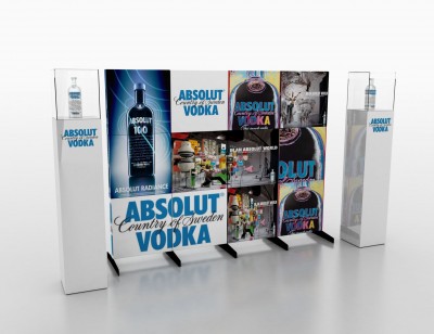
[2]Absolut recently used stand-alone ‘murals’ to promote vodka in independent stores throughout Western Canada.
Absolut
To promote its vodka in independent stores throughout Western Canada, Absolut used a flexible, stand-alone 2.4 x 1.8-m (8 x 6-ft) ‘wall mural’, printed on lightweight corrugated fibreboard. It featured visuals depicting the company’s various products, along with graphics conveying its ‘In an Absolut World’ advertising strategy. Depending on the outlet, the mural was sometimes produced in a smaller size, but without having to change the creative content.
Each in-store display was completed with a pair of 2.4-m (8-ft) tall podiums topped with product showcase towers. The flexibility of these display elements allowed an easy transition when Absolut wanted to promote small-batch super-premium products, such as its limited-edition Elyx vodka.
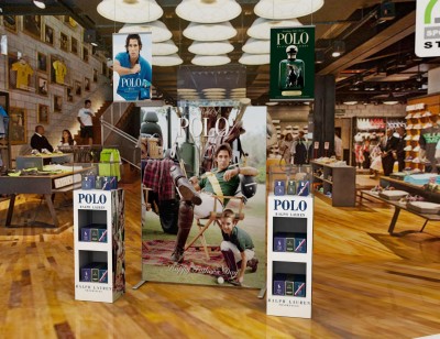
Ralph Lauren
While it has become one of the most recognized men and women’s clothing brands, Ralph Lauren also produces Polo, a signature fragrance.
The company recently promoted Polo by dominating the centres of its retail stores with POP displays. Inkjet printed and laminated 2.4 x 1.8-m (8 x 6-ft) ‘straight wall’ posters were given a central position, flanked by two product showcases on either side of the wall. Behind each main poster, two banners were hung from the ceiling to complete the high-impact visual environment, blending in with the overall design of Ralph Lauren’s stores and their other merchandise.
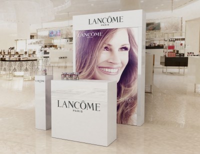
Lancôme
French cosmetics house Lancôme promoted its new fragrance, La Vie Est Belle, in North America with an advertising campaign strategy that translated its name into English: ‘Life is Beautiful.’
A dominant backdrop visual of movie star Julia Roberts, the company’s ‘global ambassador’ and face of the fragrance, was mounted behind a clear acrylic panel counter and showcase tower in Sears department stores. The resulting display simulated cosmetics counter space solely devoted to the single product.
 [3]
[3]Ralph Lauren has used a combination of banners, posters and product showcases to promote its Polo fragrance.
Aeroméxico
When carrier airline Aeroméxico wanted an oversized display medium to advertise its on-time boarding, the company turned to information ‘totems’ that would tower above passengers’ heads, allowing an unobstructed view of the messaging.
Despite their height, the totems offered a small footprint and low weight, which made them easy to move from location to location. Snap-on panels allowed the messaging to be changed out as desired.
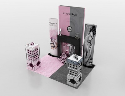
Viktor & Rolf
A Christmas display was recently designed to invite customers to step inside the house of Viktor & Rolf, a Dutch fashion company. The brand’s signature pink and grey colours were used extensively, representing female and male fragrances, with a mixture of hard and soft shapes and textures, ranging from high-gloss prints to acrylic to aluminum.
The display conveyed different stories for different products. Pink boxes with black ribbons appeared to be descending from the chimney as special gifts from Santa Claus, for example, landing at the bottom of a fireplace. One side was heavy with grey to devote space to the Spicebomb fragrance for men. On the other side, pink was used for the more modern, feminine, high-fashion Flowerbomb fragrance.
 [4]
[4]Viktor & Rolf used pink and grey graphic panels to showcase fragrances for women and men, respectively.
Flame-retardant fabric graphic panels were attached with Velcro to a lightweight, portable, stand-alone ‘wall’ frame, with magnetic locks snapping the structure into place. The pink and grey branding of these panels provided a backdrop for the black fireplace and decorative vases.
On either side of the fireplace and fabric wall, cylindrical banner stands featured complementary graphics, again targeting different groups for each fragrance.
To further define the display space, two merchandising shelving units were set up to house the products. These units used snap-on panels at the top and bottom, offering consistency throughout the display structure while allowing the flexibility to showcase different messages as appropriate to each fragrance.
An alternative path
In these ways, visual display systems are meeting the needs of highly visually oriented clients, including those who want custom-designed and fabricated projects as alternatives to off-the-shelf (OTS) displays.
Through a combination of strong customer service and innovative industrial design, today’s sign shops can distinguish themselves in the market and stand out from the standard banner crowd.
Diane Carter, president of Carter Craig Communications, provides marketing for Accenta Display in Mississauga, Ont., which designs, manufactures and distributes a range of portable and customized POP displays throughout the Americas, along with outside representation serving Europe. For more information, contact the company via e-mail at info@accenta.ca[5].
- [Image]: http://www.signmedia.ca/wp-content/uploads/2014/02/LANCOME.jpg
- [Image]: http://www.signmedia.ca/wp-content/uploads/2014/02/ABSOLUT-VODKA.jpg
- [Image]: http://www.signmedia.ca/wp-content/uploads/2014/02/006-1POLO.jpg
- [Image]: http://www.signmedia.ca/wp-content/uploads/2014/02/VIKTORROLF2.jpg
- info@accenta.ca: mailto:%20info@accenta.ca
Source URL: https://www.signmedia.ca/standing-out-from-the-crowd/