
Interpretive design
The zoo awarded the design contract to R+P in early 2012. Since the proposal stage, R+P had also brought on Blue Sky Design—a Toronto-based partnership between Ruth Freeman and Paul Martinovich, who both had decades of museum exhibit planning experience (and have since retired)—as a subcontractor for the interpretive design work, which involved defining the exhibit’s messages and matching them to appropriate locations.
After meeting with many representatives of the zoo, including site planners, educators and animal caregivers, Martinovich and Freeman toured the space for the interpretive centre and narrowed down the key messages that would be communicated along the visitors’ path.
“Ruth and I drafted the project’s goals and objectives, distilled the messages and came up with ways to convey them,” says Martinovich, who has a background in biology and had also worked with the zoo in the ‘80s. “That took about three months.”
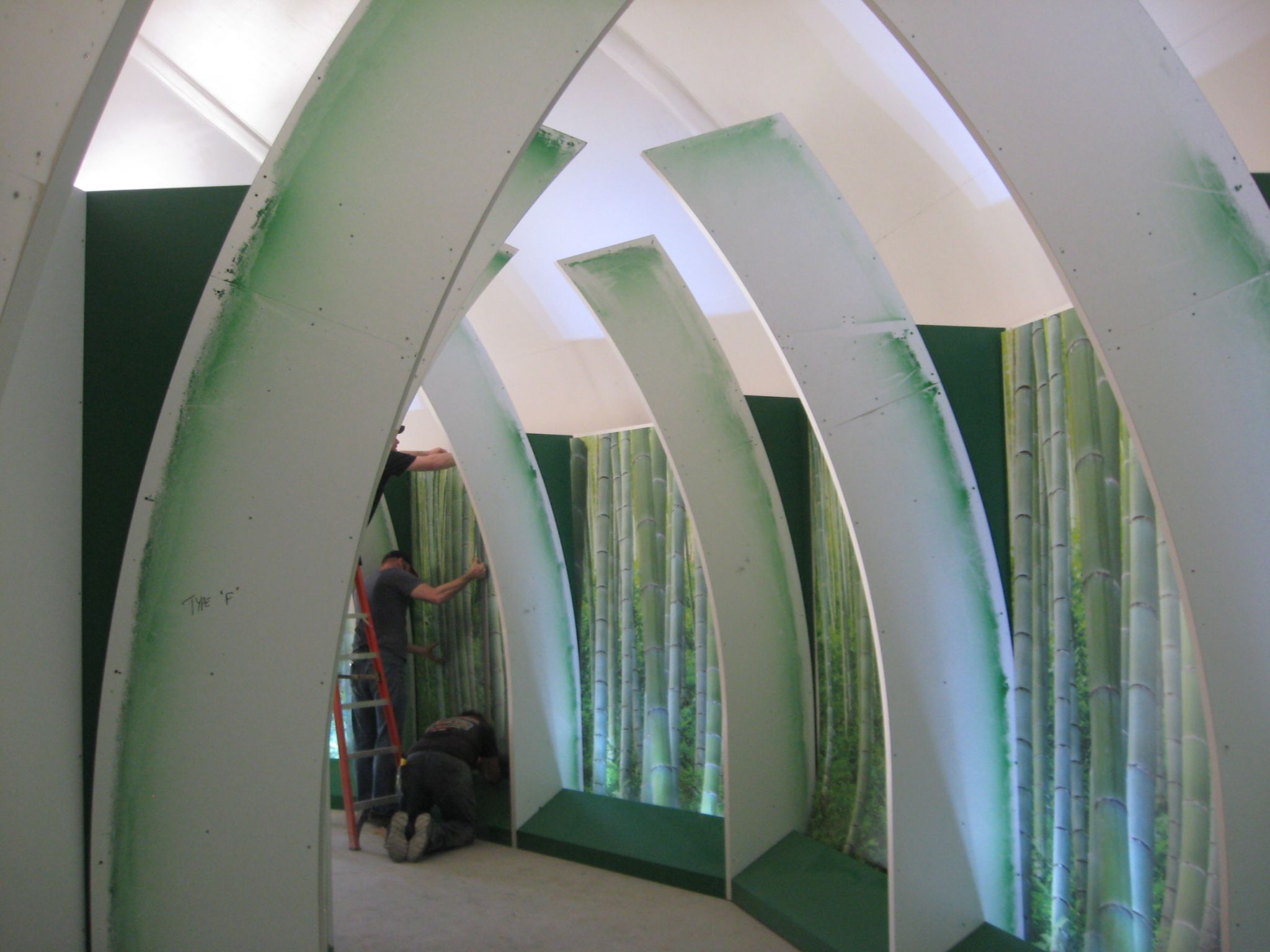
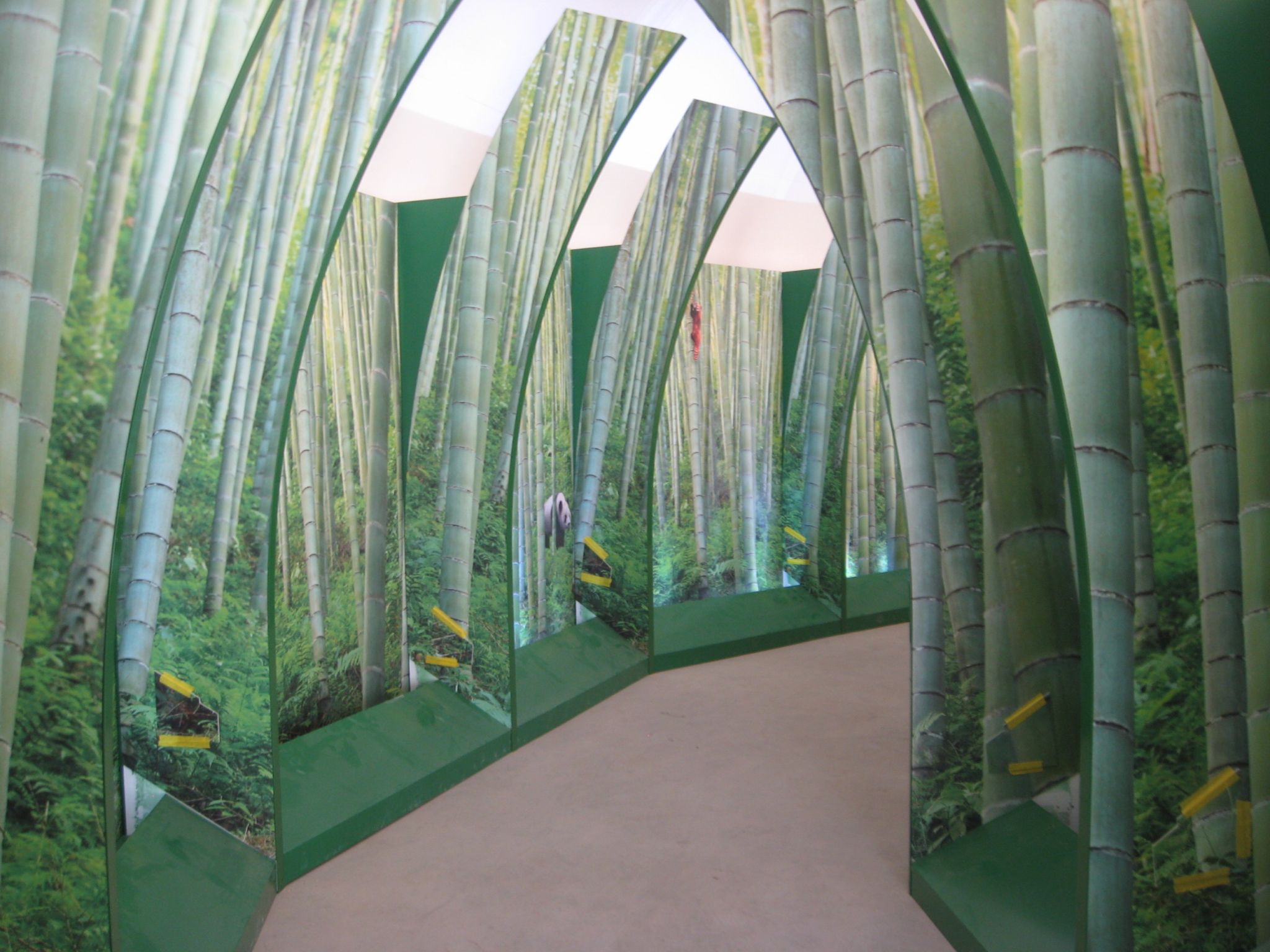
Wooden frames were installed as the basis for the ‘bamboo corridor,’ then graphics were added.
Smith and her team at R+P collaborated with the zoo representatives and Blue Sky to further develop the themes and layout, including the interactive components.
“There was some tweaking, but R+P’s plan was very complete,” says Mitchell.
“We worked with R+P and the audiovisual (AV) team to determine which ideas could be conveyed with traditional graphics and which would benefit more from interactivity,” says Martinovich, “and what could be done within the budget and timeline. The main challenge was finding the balance between ‘processing’ crowds of people and engaging them individually.”
“When we came up with the original concept, we didn’t limit ourselves for the budget, so then some of it was dialled back,” Smith explains. “This way, if the zoo gets more funding in the future, there are already ways to enhance the interpretive centre.”
With many stakeholders involved in conceptualization early on, the process moved quickly. Designs were fast-tracked and signed off on without major changes. Within a shared mandate, the various designers were able to contribute according to their specialties.
“Our work overlaps with visual design, but is different,” Martinovich explains. “We provide feedback for graphic designers to help make the visuals more effective at communicating ideas to visitors. We recommended displaying key messages in English and Chinese, for example, and adjusted the length of the text to help make sure both languages could fit on one panel.”
Blue Sky and R+P’s efforts garnered positive early feedback from zoo management.
“They were happy with what we did, since it brought the zoo’s interpretation up to what today’s visitors have come to expect,” says Martinovich. “This project is intended to communicate in modern and visitor-friendly ways.”
“It’s ultimately the zoo’s project, but it does look different from anything else at the zoo,” says Smith. “They’re used to kid-focused graphics with lots of funny fonts. We also wanted to be respectful to Chinese culture with more modern graphics, not the typical kitschy, old-fashioned Western view of China.”


