The Bear Facts: Interpreting pandas
by all | 23 September 2013 8:30 am
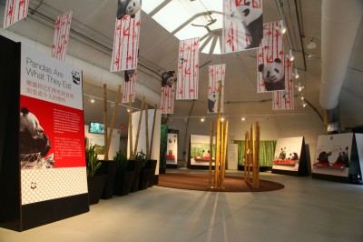
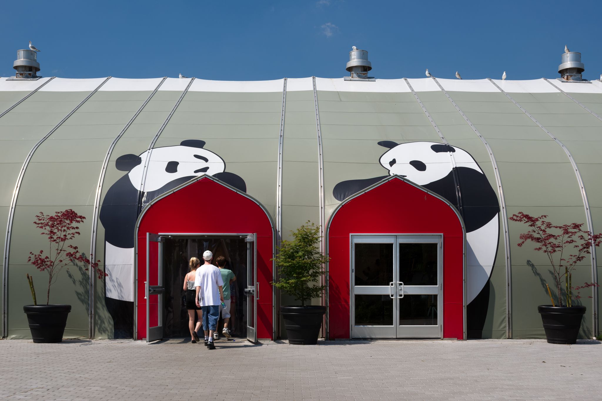 [1]
[1]Photo courtesy R+P
By Peter Saunders
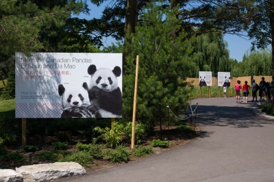
In May, the Toronto Zoo unveiled its newest guests, Er Shun and Da Mao, two giant pandas on loan from China. As part of a long-term conservation agreement, the breeding pair (female and male, respectively) will be hosted in Toronto for at least five years. They may then be relocated to the Calgary Zoo for an additional five years, but should they breed successfully while in Toronto, the pandas and their offspring will remain in place until the move can be approved, housed in their recently renovated enclosure (previously a tiger exhibit).
When Toronto Zoo visitors arrive for the Giant Panda Experience, before they can get up close to Er Shun and Da Mao at the enclosure, they will first pass through the Panda Gate and the climate-controlled Panda Interpretive Centre, a tented zone that uses static, digital and interactive signage to educate them about pandas, bamboo (the bears’ primary food), conservation efforts and related topics. With the zoo anticipating up to 10,000 people to visit the attraction every day, the interpretive centre offers a 10- to 30-minute learning experience to keep visitors engaged while in line.
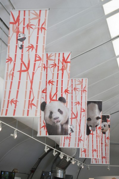
Toronto-based Reich+Petch (R+P) led the design of the 743-m2 (8,000-sf) interpretive centre, which entailed a number of themed areas, China-inspired imagery, multimedia resources and modern esthetics. The exhibit design firm punctuated the clean white lines of the tent with red accents and incorporated black-and-white structures to represent the pandas’ colouring.
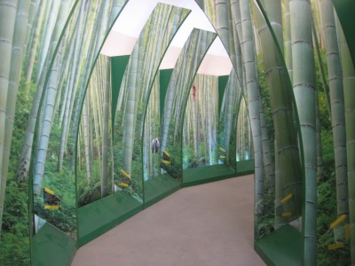
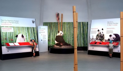
Images include life-sized animal photos, bamboo patterns and other environmental graphic design (EGD) elements. A large display showcases the amount of bamboo offered to each panda daily, for example, while an interactive game challenges players to find pandas in their natural Chinese habitats. A multimedia presentation showcases some of the people working behind-the-scenes at the zoo to care for the pandas. And a 3.7 x 2.1-m (12 x 7-ft) touch-sensitive video wall allows visitors to connect isolated panda habitats by planting bamboo trees. Finally, guests walk through a simulated bamboo forest and out of the centre to see Er Shun and Da Mao.
“Visitors are immersed in everything they need to know about these iconic, fascinating and endangered animals,” says Carolyn Smith, senior designer at R+P. “Our aspiration is the experience will inspire them to join in conservation efforts currently underway.”
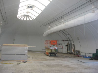 [2]
[2]An existing tent structure at the zoo was renovated to create the Panda Interpretive Centre. Photos courtesy Toronto Zoo
Planning and logistics
Planning the interpretive centre began at the zoo, with project manager Leona Mitchell responsible for overseeing all design and construction work.
“We were working with existing spaces,” she explains. “The enclosure will become home for the tigers again after the pandas leave. And the interpretive centre is where we previously had Stingray Bay, a short-term exhibit where visitors could touch and feed sea creatures.”
In repurposing these spaces, Mitchell had to balance design goals with logistics. When the zoo first featured giant pandas in 1985, with Qing Qinq and Quan Quan paying a mere 100-day visit, throngs of visitors suffered through three-hour lineups.
“We have information about those lineups, so we knew what to anticipate this time,” says Mitchell.
“You don’t want people to feel they’re in a line,” says R+P’s Smith, who served as project co-ordinator and lead designer. “Back in the 1980s, the zoo was completely unprepared for the huge numbers of visitors. So, there was a concerted effort this time to give people something to do.”
Interpretive design
The zoo awarded the design contract to R+P in early 2012. Since the proposal stage, R+P had also brought on Blue Sky Design—a Toronto-based partnership between Ruth Freeman and Paul Martinovich, who both had decades of museum exhibit planning experience (and have since retired)—as a subcontractor for the interpretive design work, which involved defining the exhibit’s messages and matching them to appropriate locations.
After meeting with many representatives of the zoo, including site planners, educators and animal caregivers, Martinovich and Freeman toured the space for the interpretive centre and narrowed down the key messages that would be communicated along the visitors’ path.
“Ruth and I drafted the project’s goals and objectives, distilled the messages and came up with ways to convey them,” says Martinovich, who has a background in biology and had also worked with the zoo in the ‘80s. “That took about three months.”
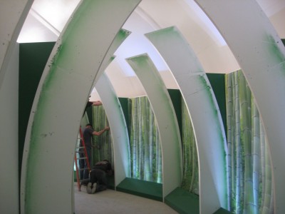 [3]
[3]Wooden frames were installed as the basis for the ‘bamboo corridor,’ then graphics were added.
 [4]
[4]Smith and her team at R+P collaborated with the zoo representatives and Blue Sky to further develop the themes and layout, including the interactive components.
“There was some tweaking, but R+P’s plan was very complete,” says Mitchell.
“We worked with R+P and the audiovisual (AV) team to determine which ideas could be conveyed with traditional graphics and which would benefit more from interactivity,” says Martinovich, “and what could be done within the budget and timeline. The main challenge was finding the balance between ‘processing’ crowds of people and engaging them individually.”
“When we came up with the original concept, we didn’t limit ourselves for the budget, so then some of it was dialled back,” Smith explains. “This way, if the zoo gets more funding in the future, there are already ways to enhance the interpretive centre.”
With many stakeholders involved in conceptualization early on, the process moved quickly. Designs were fast-tracked and signed off on without major changes. Within a shared mandate, the various designers were able to contribute according to their specialties.
“Our work overlaps with visual design, but is different,” Martinovich explains. “We provide feedback for graphic designers to help make the visuals more effective at communicating ideas to visitors. We recommended displaying key messages in English and Chinese, for example, and adjusted the length of the text to help make sure both languages could fit on one panel.”
Blue Sky and R+P’s efforts garnered positive early feedback from zoo management.
“They were happy with what we did, since it brought the zoo’s interpretation up to what today’s visitors have come to expect,” says Martinovich. “This project is intended to communicate in modern and visitor-friendly ways.”
“It’s ultimately the zoo’s project, but it does look different from anything else at the zoo,” says Smith. “They’re used to kid-focused graphics with lots of funny fonts. We also wanted to be respectful to Chinese culture with more modern graphics, not the typical kitschy, old-fashioned Western view of China.”
 [5]
[5]The completed interpretive centre comprises a number of themed areas. Photo courtesy Holman Exhibits
Graphic design
With Smith overseeing design of the interpretive centre’s specific layout and structure, R+P’s senior graphic designer Vivien Chow was called upon to develop the project’s approach for signage and other graphics.
“Our inspiration was modern oriental calligraphic art, which is predominantly black-and-white, with a punch of red,” she says. “We also echoed patterns and textures used in oriental textiles and gardens and mimicked motifs like the use of seal stamps and manufactured bamboo.”
Helvetica New was selected as the primary typeface to emphasize the modern feel. The team also decided only the titles and some of the introductory text would be translated into Chinese characters.
The informational graphics were redesigned throughout the process. There was a lot of back-and-forth with the interpretive designers, who sometimes rewrote text to better accommodate Chow’s graphics, but also suggested revisions to graphics so they would be better understood by visitors.
“The end result didn’t vary all that much from the original concept,” says Chow, “but we added elements, such as more bamboo graphics on banners.”
One major change, however, came when the zoo learned Er Shun was female, not male as originally assumed. This meant a panda switch was needed to ensure a breeding pair.
“We had incorporated into our graphics the story of Ji Li, a female panda, but then she had to be switched out for the male Da Mao,” says Smith. “As a nod to Ji Li, she’s still included in a ‘panda mating game’ exhibit.”
 [6]
[6]Indoor displays used screenprinted vinyl mounted onto expanded closed-cell PVC boards. Photos courtesy R+P
AV systems
Ottawa-based Global Exhibit Technology and the Toronto-based Design Foundation handled the interpretive centre’s AV elements. Specifically, the former supplied systems and managed the project, while the latter shot video content and configured the interactive screens.
“As the project authority, R+P got the information for us about the AV design,” says Ted Ratcliffe, Global Exhibit partner and project manager. “We set up the 4.3-m (14.1-ft) ‘bamboo tree planting’ video wall with an infrared (IR) multi-touch detector, as well three interactive screens for the ‘find the panda’ game, which allows visitors to zoom in on pandas in their habitats.”
While R+P did not work directly on any of the digital signage, Chow provided her graphic design files to the Design Foundation to integrate into the on-screen content.
“They used our bamboo texture, for example, in their ‘meet the experts’ footage,” she says.
The interpretive centre’s AV design also saw relatively last-minute changes, as more equipment was donated by corporate sponsors.
“The ‘find the panda’ game was enhanced right before the exhibit opened with the addition of large monitors overhead, which let other people see what’s going on,” says Smith. “Also, Federal Express (FedEx) has donated monitors that show content explaining how they delivered the pandas from China to Canada.”
Fabrication and installation
In January 2013, R+P had to find a fabricator to turn the sign designs into reality. The firm turned to Toronto-based Holman Exhibits, with which it had worked in the past.
 [7]
[7]Outdoor signs were made with MDO plywood panels.
“As we develop our designs, we work with exhibit specialists to ensure we have a good sense of what’s possible or not, in terms of substrates and graphic production techniques,” says Chow. “Once the project is at the fabrication stage, however, the exhibit fabricator may recommend other material choices that are better-suited to accomplishing our design goals.”
“After we visited the site, we changed some of the material specifications, as it wasn’t yet climate-controlled,” explains James Cummings, project manager for Holman. “We also added components to the designs, such as ‘kicks’ that protect the graphics from being bumped when the centre is being cleaned.”
Indeed, while Holman’s project bid was based on R+P’s original design package, there were numerous changes between the proposal and the installation (which Holman also handled directly).
“It’s hard to visualize everything until you mock it up with proofs and samples,” says Cummings. “As we built lighting panels, for instance, we could better determine the exactquantity needed for the space. We prototyped a lot of stuff for this project.”
In another example, many of the banners and signs needed to be installed within weighted frames to avoid being blown around by the facility’s large ceiling fans.
Indoor signs were constructed by mounting screenprinted vinyl onto expanded closed-cell polyvinyl chloride (PVC) boards, so graphics could be easily removed and changed when needed. Outdoor signs used medium-density overlay (MDO) plywood panelling, a more weather-resistant substrate.
 [8]
[8]Many of the banners needed to be installed within weighted frames to avoid being blown around by the facility’s large ceiling fans.
“We also added structural adhesives to hold curved panels in place,” Cummings says. “These are five-year displays, so they have to be resilient.”
This attention to detail helped reassure R+P the designs could be physically achieved within the newly renovated space.
“We like to have the people who produce graphics also install them,” says Smith.
As it turns out, one of Holman’s simplest tasks was not sign-related at all, where the design called for a full-scale pile of simulated panda poo.
“Pandas eat lots of bamboo, but they only get a few nutrients from it, so it passes through their system nearly unchanged,” Cummings explains. “This means you can just put bamboo in a blender and what comes out is very similar to panda poo. And that’s what we did. We started with a foam structure and covered it with chopped up bamboo. It was easy!”
The project’s main challenge, meanwhile, was the time frame for installation. Although Cummings and his team were brought on-board well ahead of time, the renovations for the interpretive centre were not finished until several months later.
“We had to wait until the building was complete,” he says, “then we had four weeks to get everything in there. And with updates, we received graphics in batches. On the Tuesday before the Friday the exhibit opened, we were still getting drawings for graphics we would have to install on Thursday. The work itself was all fairly straightforward, though.”
With files from the Toronto Zoo, R+P, Holman Exhibits and Global Exhibit Technology. For more information, visit www.torontozoo.com[9], www.reich-petch.com[10], www.holmanexhibits.com[11], www.global-exhibit-tech.com[12].
To view the full article, click here[13].
- [Image]: http://www.signmedia.ca/wp-content/uploads/2014/01/03_TO_Pandas.jpg
- [Image]: http://www.signmedia.ca/wp-content/uploads/2014/01/IMG_3538.jpg
- [Image]: http://www.signmedia.ca/wp-content/uploads/2014/01/IMG_3960.jpg
- [Image]: http://www.signmedia.ca/wp-content/uploads/2014/01/IMG_4269.jpg
- [Image]: http://www.signmedia.ca/wp-content/uploads/2014/01/IMG_1311.jpg
- [Image]: http://www.signmedia.ca/wp-content/uploads/2014/01/05_TO_Pandas-adj.jpg
- [Image]: http://www.signmedia.ca/wp-content/uploads/2014/01/12_TO_Pandas.jpg
- [Image]: http://www.signmedia.ca/wp-content/uploads/2014/01/13_TO_Pandas.jpg
- www.torontozoo.com: http://www.torontozoo.com
- www.reich-petch.com: http://www.reich-petch.com
- www.holmanexhibits.com: http://www.holmanexhibits.com
- www.global-exhibit-tech.com: http://www.global-exhibit-tech.com
- here: http://www.kenilworth.com/publications/smc/de/201309/files/16.html
Source URL: https://www.signmedia.ca/the-bear-facts-interpreting-pandas-2/