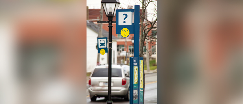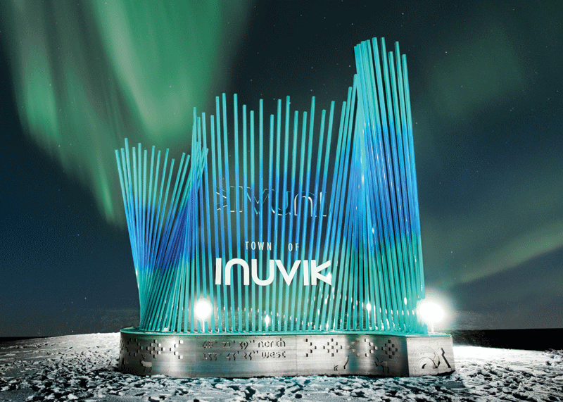
To the outside world, wayfinding design seems like a creative exploration within the esthetic realm. However, the reality is much more complex, and, ultimately, more interesting. Photos courtesy Fathom Studio
By Adam Fine
I never expected to be involved in the sign industry. Years ago, when I joined Fathom Studio, a collective of landscape architects, architects, planners, and graphic designers on the East Coast, I wanted to launch right into city planning.
However, my first projects were all signage related, mostly in wayfinding and interpretation. Wayfinding, of course, is the art and science of guiding people through spaces, while interpretation is about telling the stories of places, whether natural, cultural, or historical. I was surprised to find I was not bored with these types of projects. In fact, I quickly found myself taking photos of signs everywhere I went, wanting to understand them better: on vacation, walking to work, or out doing errands. Now, my family—ever patient—expects me to stop every few hundred metres to capture photos of signs, both good and bad. I might even have as many pictures of signs as I have of my daughter.
Today, I lead a team of designers who work with municipal, provincial, private, and not-for-profit clients to create sign systems. We have developed these types of projects on many scales, from small trails and parks, through hospitals and universities, up to entire municipalities, and we help guide clients through the many decisions involved in wayfinding design.
To the outside world, wayfinding design seems like a creative exploration within the esthetic realm—beauty and expression bringing forth the best possible sign designs. However, the reality is so much more complex, and, ultimately, more interesting. How the signs look is not always their most important attribute. The best wayfinding designs are a balance of so many factors coming together. In each design, we consider context, accessibility, durability, cost, modularity, inclusiveness, destination criteria, nomenclature, typography, legal requirements, standardization, and more. Sometimes, we are designing a specific sign for a specific place, but much more frequently, we are designing sign types—vessels ready to be filled with information, to be delivered in a specific way.
We help our clients plan their signage programs just as much as we design them, and our contribution to the world of signage is our “discovery process.” We explore the balancing factors and constraints early on in our projects, so when we do begin design, we can make decisions with the necessary understanding. Below are just some of the considerations we address at the start of each wayfinding project.
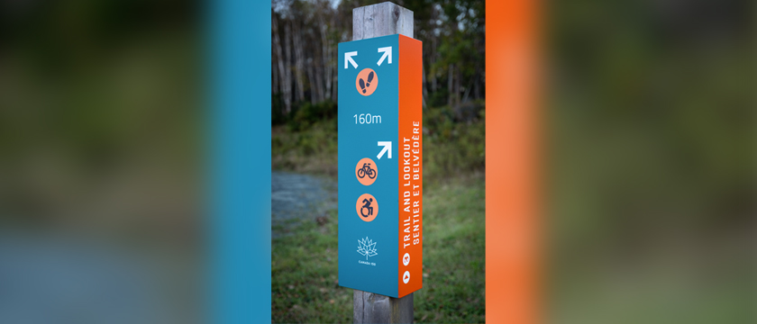
Context
They say, “content is king,” but when it comes to wayfinding, context is what is really in charge. Most projects begin with a site visit, an audit, an inventory of any existing signs, and/or a walkthrough with the client. We list the environments the new signs will appear in and provide details on how those environments might impact the design. Interior, exterior, road, trail, airport, or hospital? How might it feel to be there? Would a white-background sign work in an environment that is snowy for months of the year? How would a small sign work in a wide-open rural landscape? Will the sun create glare that will render a sign illegible? Will illumination or retro-reflectivity be needed to make sure the sign is legible at night or in low light? It is impossible to design a useful sign without first understanding its installation context.