The design before the sign
by carly_mchugh | 31 March 2023 4:39 pm
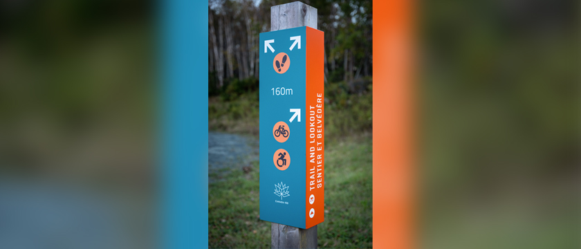
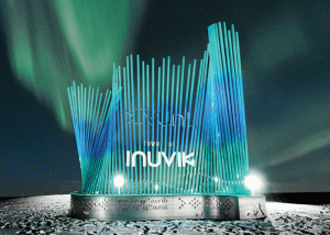 [1]
[1]To the outside world, wayfinding design seems like a creative exploration within the esthetic realm. However, the reality is much more complex, and, ultimately, more interesting. Photos courtesy Fathom Studio
By Adam Fine
I never expected to be involved in the sign industry. Years ago, when I joined Fathom Studio, a collective of landscape architects, architects, planners, and graphic designers on the East Coast, I wanted to launch right into city planning.
However, my first projects were all signage related, mostly in wayfinding and interpretation. Wayfinding, of course, is the art and science of guiding people through spaces, while interpretation is about telling the stories of places, whether natural, cultural, or historical. I was surprised to find I was not bored with these types of projects. In fact, I quickly found myself taking photos of signs everywhere I went, wanting to understand them better: on vacation, walking to work, or out doing errands. Now, my family—ever patient—expects me to stop every few hundred metres to capture photos of signs, both good and bad. I might even have as many pictures of signs as I have of my daughter.
Today, I lead a team of designers who work with municipal, provincial, private, and not-for-profit clients to create sign systems. We have developed these types of projects on many scales, from small trails and parks, through hospitals and universities, up to entire municipalities, and we help guide clients through the many decisions involved in wayfinding design.
To the outside world, wayfinding design seems like a creative exploration within the esthetic realm—beauty and expression bringing forth the best possible sign designs. However, the reality is so much more complex, and, ultimately, more interesting. How the signs look is not always their most important attribute. The best wayfinding designs are a balance of so many factors coming together. In each design, we consider context, accessibility, durability, cost, modularity, inclusiveness, destination criteria, nomenclature, typography, legal requirements, standardization, and more. Sometimes, we are designing a specific sign for a specific place, but much more frequently, we are designing sign types—vessels ready to be filled with information, to be delivered in a specific way.
We help our clients plan their signage programs just as much as we design them, and our contribution to the world of signage is our “discovery process.” We explore the balancing factors and constraints early on in our projects, so when we do begin design, we can make decisions with the necessary understanding. Below are just some of the considerations we address at the start of each wayfinding project.
Context
They say, “content is king,” but when it comes to wayfinding, context is what is really in charge. Most projects begin with a site visit, an audit, an inventory of any existing signs, and/or a walkthrough with the client. We list the environments the new signs will appear in and provide details on how those environments might impact the design. Interior, exterior, road, trail, airport, or hospital? How might it feel to be there? Would a white-background sign work in an environment that is snowy for months of the year? How would a small sign work in a wide-open rural landscape? Will the sun create glare that will render a sign illegible? Will illumination or retro-reflectivity be needed to make sure the sign is legible at night or in low light? It is impossible to design a useful sign without first understanding its installation context.
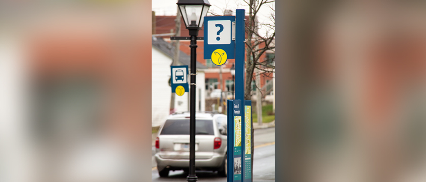


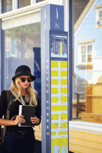 [2]
[2]For each project, it is important to consider who will be reading the signs, what they expect from them, and how they may be reading them. Photos by Scotty Sherin
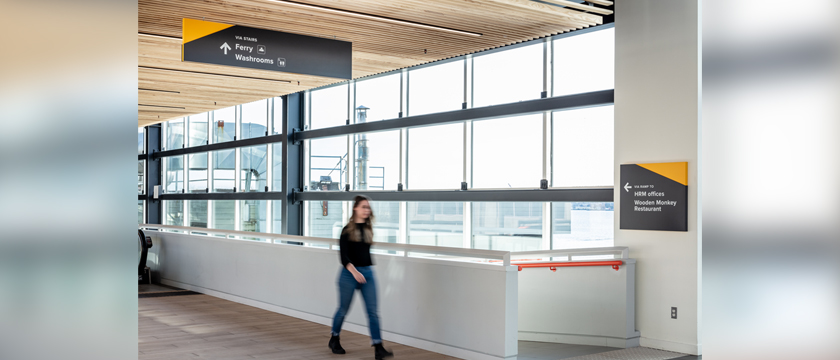
Users
Different users have different needs. Fundamentally, we have to consider who will be reading these signs, what they expect from them, and how they may be reading them. The kind of sign we might design for a hiker—willing to stop for a minute to look at a trailhead map—is very different from the sign we would design to be read from a vehicle travelling at 100 km/h (62 mph). Will the sign be read from 1 m (3.2 ft) away or 50 m (164 ft) away? This not only impacts the scale of the sign and the typographic choices, but also how much information can be communicated. Sign users in different environments may respond very differently to information. Imagine the likely difference between a vacationer exploring a national park and a traveller in an international airport. Undoubtedly, the former is going to be a lot more patient and receptive to the information around them.
Accessibility
Provinces across Canada are developing, or have already developed, accessibility guidelines to ensure certain types of signs are designed for a wide range of users. Guidelines like the Design of Public Spaces Standard, part of the Accessibility for Ontarians with Disabilities Act (AODA), provide some guidance on sign design. However, the reality is the accessibility standards are limited in scope, and do not provide much specific guidance to sign designers. In addition to the legislated accessibility guidelines and building codes, we rely on various studies and standards available in the public realm, as well as generally accepted best practices for graphic design. Most importantly, there is no substitute for discussions with people with lived experience to ensure designs will meet people’s needs rather than just provide compliance.
Durability
The answer to, “How long do you want it to last?” is usually, “As long as possible.” However, everything decays, and signs are no different. Each project includes a detailing of threats to signs, and it is always interesting to hear the concerns and past experiences. In some locales, Mother Nature is the greatest threat to signs’ longevity, most commonly through snow, sunshine, and wind. In others, humans present challenges such as graffiti, arson, and theft of materials, or even whole signs. Fabricators and manufacturers have developed many ingenious systems to deter or push back against these threats. However, none of them are infallible, and most come with additional costs or trade-offs.
What few mention is the longevity of the message or the sign’s purpose. Signs are often in the ground for years—is there a future when the sign needs to be repurposed, or its message adjusted? The answer is never simple. Modular signage is generally more expensive than permanent signage, but spending more initially can save money in the long run, to accommodate frequent changes of information. In other cases, spending more on modular signs is wasted when the signs are never altered. We can help clients decide the right course of action depending on the need.
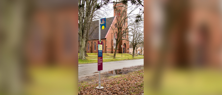
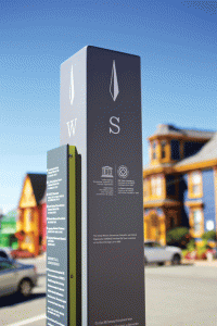
 [3]
[3]In wayfinding signage, there is a hierarchy of destinations. The ones almost everyone looks for are regarded as primary, while others are secondary. Photo courtesy Fathom Studio
Cost and implementation
The scale of signage projects can be incredibly variable. A small park might have signs in the tens, but building projects may have hundreds of signs, and municipalities thousands. We work with our clients to plan the implementation of signs, working out likely fabrication and installation estimates and planning phased implementation scenarios that respect annual budgets.
Implementation is important, but we often recommend going further to ensure signs are cared for over time. There should be a plan for maintenance, so installed signs are someone’s responsibility. A wayfinding sign that is damaged or missing reflects poorly on the institution who paid for it, as do signs blocked by branches, snow piles, or other issues.
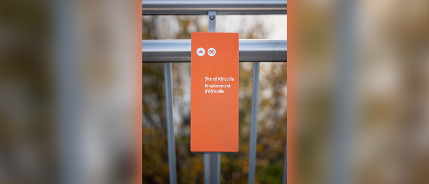
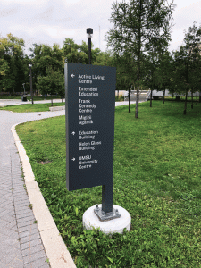
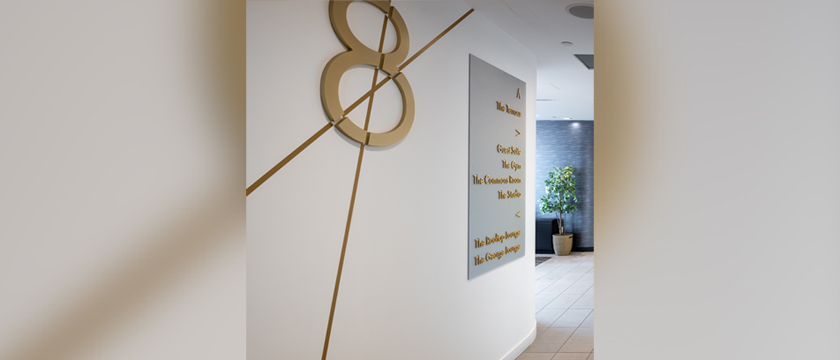
Destinations and nomenclature
We often spend a fair bit of time refining and discussing which destinations we want to include in signs, as they can only direct to a few destinations at a time. Indeed, there is a hierarchy of destinations, with some being primary, and many more secondary. The primary destinations might be ones almost everyone looks for, such as “Registration,” or the washrooms in a hospital. Names have to be short, simple, and generally understood, and sometimes there is a perfectly good generic name that works best. For example, if a municipality has just one library, directing people to the “Library” on signs is often more effective than using its official name. Some wayfinding signs also need to be multilingual, which usually requires more “real estate.”
Conclusion
Wayfinding systems are so much more than sign templates and design drawings. They are meant to be in place for years, as well as added to, edited, and reused again and again. Helping clients weigh key considerations such as context, users, accessibility, durability, cost and implementation, and destinations and nomenclature is important for every sign system, and I hope others in the industry will use them as a guide for their own future projects.
Adam Fine is a planner with a passion for signs. He has helped organizations of all kinds improve their public spaces and rights-of-way with better signage—signs that welcome newcomers, help people find their way in unfamiliar places, tell big stories, and reveal small ones. In concert with his colleagues at Fathom Studio, Fine has worked on interpretive and wayfinding plans for a wide range of clients, including large and small municipalities, trail groups, Parks Canada, provincial parks departments, and university and college campuses across the country.


- [Image]: https://www.signmedia.ca/wp-content/uploads/2023/03/PG34_Inuvik-Gateway-Sign-Update-Edit.gif
- [Image]: https://www.signmedia.ca/wp-content/uploads/2023/03/PG34_Pedestrian-Directional-Lunenburg-Signage-credit-Scotty-Sherin-05NOV2014_4394.gif
- [Image]: https://www.signmedia.ca/wp-content/uploads/2023/03/PG34_UniversityofManitoba_IMG_6601.gif
Source URL: https://www.signmedia.ca/the-design-before-the-sign/