
How to master the art of ink, colour, and design
By Marika Gabriel
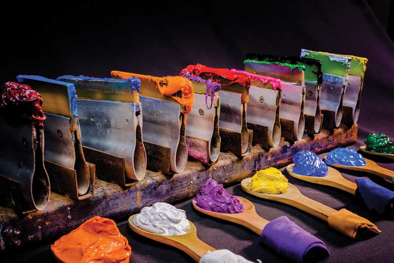
Artwork preparation aside, screenprinting remains a largely analog craft. Photo © Thaisign/bigstockphoto.com
In a world where digital printing dominates and grows, screenprinting stands out as a classic analog craft. This intricate process involves using multiple screens, each coated with a photosensitive emulsion for different colours.
Caitlin Watson, owner of Sugarbomb Toronto, recently shared her expertise with Sign Media Canada, exploring screenprinting nuances, including discharge printing, Pantone matching, and the distinctive split fountain technique.
Sign Media Canada (SMC): What is involved in the process of screenprinting and how does it differ from other printing methods?
Caitlin Watson (CW): Screenprinting involves burning screens coated with a photo-sensitive emulsion, where each screen represents one colour in the print. This process remains largely analog, except for artwork preparation, which is typically done using Adobe Photoshop, Illustrator, or other software. This contrasts with other printing methods such as direct-to-garment (DTG), direct-to-film (DTF), and sublimation printing, which are predominantly digital.
SMC: What is discharge printing? What are its benefits?
CW: Discharge printing is a technique that bleaches the fabric and then lays down the pigment. It results in a lighter feel compared to traditional plastisol printing and produces a smooth finish.
SMC: What types of garments are best suited for discharge printing?
CW: The entire process of discharge printing is best suited for garments that are 100 per cent cotton.
SMC: How does Pantone matching work, and why is it important?
CW: Pantone matching involves measuring and mixing exact ratios of colour to match a Pantone swatch. This is crucial for adhering to brand standards and ensuring client satisfaction with precise colour reproduction. It is also essential for consistency in reprints, ensuring colours from the last run match the next one.
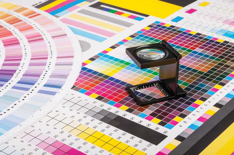
Pantone matching involves measuring and mixing exact ratios of colour to match a Pantone swatch. Photo © Stepan Bormotov/bigstockphoto.com
SMC: What is the split fountain printing technique? What makes it unique?
CW: Split fountain printing uses multiple colours on the same screen—blending them slightly before printing to create a gradient effect and allow a smooth transition between two colours or more. This technique is unique because traditional screenprinting typically uses one colour per screen. Split fountain allows multiple colours to be printed from a single screen, creating a visually appealing gradient or rainbow effect.
SMC: What considerations should a client keep in mind when choosing screenprinting?
CW: Clients should ensure the quality of the artwork they provide is high, as low-resolution images such as JPEGs are unsuitable for printing. This is important during the process of quoting as well, because we need to make sure we can see the entirety of the artwork in the quality it is meant to be printed in.
SMC: How do you handle complex designs with multiple colours and intricate details?
CW: Complex designs or those involving multiple colours require colour separation, which can be done in Adobe Photoshop. This may also require the addition of halftones. This process is similar to a newspaper style, where everything is comprised of tiny dots. When a tone of grey is needed, it can be achieved by printing black in small dots, which appear lighter and can take on the tone of the colour underneath these halftones. While a high degree of detail can be achieved, there are limitations, especially with smaller print sizes. For instance, a 76.2-mm (3-in.) left chest print cannot hold as much detail as a 406.4-mm (16-in.) back print.


