
Troubleshooting calibration for colour management
By Ernst Vegt
In the early days of colour management, vendors of calibration software and devices did not always deliver on their promises of producing better colours with greater predictability. Everyone had different approaches to the emerging field, developing their own ‘secret sauce’ in the hope they could corner the market.
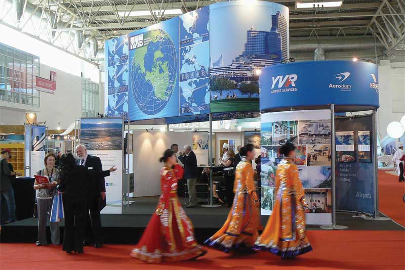
Today, however, this is no longer the case. Colour management helps sign companies, print service providers (PSPs), photographers and advertising agencies better control the reproduction of colours from input devices, such as cameras and scanners, to output devices, such as wide-format inkjet printers.
Nevertheless, colour management consultants are frequently called upon by these clients to help create a more sensible workflow and make sure all of the various input and output devices across that workflow behave as they should.
One of the first steps in these cases is to calibrate (i.e. profile or characterize) the computer monitors. Very often, the client will put out an old monitor calibration device and explain it has not proven effective, complaining the images as viewed on-screen appear nothing like the printed output. The question this raises is what target was used for the monitor’s calibration—and the client’s response to this question is usually a puzzled look.
The right settings
Calibrating or profiling a monitor involves setting various parameters, such as luminance (i.e. brightness) and gamma (i.e. tone reproduction curve). There are also options to set the colour temperature of the ‘white point,’ commonly with a range from 5,000 to 6,500 K.
Most professionals in the graphic arts industry set the monitor’s luminance to 120 cd/m2, the gamma to 2.2 (now the standard for all monitors) and the white point to between 5,000 and 5,500 K and use its native contrast ratio for the optimal effect. These settings ensure the monitor is not too bright, in comparison to a print or proof, and the tonality is correct, with both delicate highlights and dark shadow details preserved. Greys should appear neutral.
The choice of white point may seem less intuitive, given most monitors appear much whiter at 6,500 K than they do at 5,000 K, but this is actually a bluer white. The colour temperature of the sun, as measured on Earth between mid-morning and mid-afternoon, is around 5,000 K and is considered a perfect basis for viewing. Part of what makes it ideal, of course, is the availability of sunlight all around the world.
Manufacturers of monitor calibration devices, however, have generally neglected to mention and highlight the high importance of controlling one’s ambient lighting to such a white point. The human eye is magnificent at adapting to various lighting conditions, but unfortunately, computer monitors are not. So, if graphics professionals use incandescent lighting for their ambient illumination, any print or proof is going to look too ‘warm’ relative to the image on the monitor; and if they use typical industrial fluorescent tubing, the opposite will be true, with the print or proof appearing too ‘cool.’
Sign up for our newsletter
Featuring breaking news from Canada's sign and graphics industry.
Products


Read the Latest Issue

