
Troubleshooting calibration for colour management
The right lighting
Fortunately, it is neither too difficult nor too expensive to resolve this issue by bringing some sunshine indoors. One option is to hang a two-lamp-capacity, 1.2-m (4-ft) long fluorescent lighting fixture about 1 m (3.3 ft) above the monitor, then install a couple of lamps that fit the situation’s needs.
Many lighting stores carry relatively inexpensive lamps that are very close to the colour temperature requirements of 5,000 K, with a colour rendering index (CRI) of 90 or better. A silver ‘egg crate’ grill will keep the colour output of the lamps accurate and control light spill, so as to keep the illumination well-focused over the work area.
A simple—though not entirely accurate—way to test for the correct lighting is with light indicator strips. In daylight or under 5,000 K lighting, little to no variation will be visible on the strips, but under other levels of illumination, two stripes will appear. These are created through the phenomenon called metameric failure.
With metamerism, two separate samples will appear to be the same colour and shade under one light source, but different shades under another source, due to the different shapes of their spectral reflectance curves. A common example of this effect is when one gets dressed in the morning in slacks and socks whose colours match well under incandescent lighting at home, only to appear much less of a match at the office under fluorescent lighting.
The term ‘metamerism’ refers to the difference between the two colours’ reflectance curves. To avoid it, it is best to compare samples under outdoor sunlight or indoor 5,000 K light.
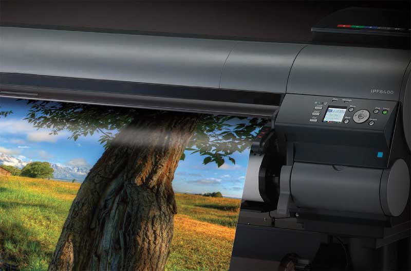
Offset inks and the toners used in colour photocopiers and desktop printers have always suffered from metamerism. Early-model inkjet printers were also prone, but with newer formulations of dyes and pigments, along with the addition of light to mid-greys, the phenomenon has been significantly reduced.
A whole new view
After controlling for ambient lighting, noticeable improvements should be achieved in the way graphic arts professionals view and compare the colours of image files on their monitors in their daily workplace. To improve the situation further, the next steps are (a) to change the monitor’s default appearance to a mid-grey and (b) to paint the surrounding walls light grey, if they are not already. These measures will help prevent image perception and comparison from being unduly influenced by nearby colours.
By way of example, a publishing company’s creative department whose proofs were repeatedly being rejected, despite a significant investment in a commercial-grade viewing booth, eventually realized whenever the sun was shining, someone was opening the window blinds. As a result, the reflectance of a bright yellow building across the street was overpowering the controlled lighting in the viewing area. Once the nature of the problem was identified, it could finally be solved.
When such a viewing area is set up properly and lit by the aforementioned fluorescent luminaires with a colour temperature of 5,000 K, it will be all the easier for large-format graphics professionals to recognize and enjoy the benefits of colour management, seeing their work in a whole new—and better—light.
Ernst Vegt is a principal with Coast Imaging Arts of Comox, B.C., which provides certified G7 colour management and related services to sign companies, print service providers (PSPs), photo labs and other organizations. This article is partly based on a seminar he presented in April at the BC Sign Association’s Sign & Graphics Show in Burnaby, B.C. For more information, visit www.coastimagingarts.com and www.bcsignassociation.com.
Sign up for our newsletter
Featuring breaking news from Canada's sign and graphics industry.
Products


Read the Latest Issue

