City
The City neighbourhood includes street art, references to skyscrapers and a stylized urban streetscape. Ceiling panels feature an original work by local artist Shallom Johnson, inspired by Vancouver’s Gastown district. Below, a bus shelter’s integrated video screen showcases how the work was developed.
Outdoor Life
Highlighting people’s interactions with their natural surroundings across Greater Vancouver, the Outdoor Life neighbourhood features representations of sailing, skiing and cycling. The sport court’s domed architecture is inspired by stadiums and arenas.
Coast Salish
Representing the Tsawwassen First Nation’s heartbeat within the mall, the Coast Salish neighbourhood features contemporary interpretations of local life and history, including a large light-emitting diode (LED) cylinder that digitally displays animation.
Filling the facility with signs
Knight Signs, which is headquartered nearby within Delta, B.C., submitted a quote for the mall’s main exterior and interior signage in 2014, made the shortlist that same year and won the contract in early 2015.
“The timing allowed us to roll things out gradually, between the other tradespeople’s work,” explains Dale Wlasichuk, account executive. “Our first installations were in December 2015 and we had crews on-site right up to the night before opening.”
Knight Signs’ direct client for the project was Ledcor Group, the general contractor for the mall’s construction, but the sign company had also done work for Ivanhoé Cambridge since the 1990s.
“Tsawwassen Mills was planned and mapped out very well when we came on-board, so the scope changed very little over the course of the project,” he says. “Our proximity to the mall was also helpful, as we were able to do a lot of staging of signs in our 4,645-m2 (50,000-sf) facility before installing them.”

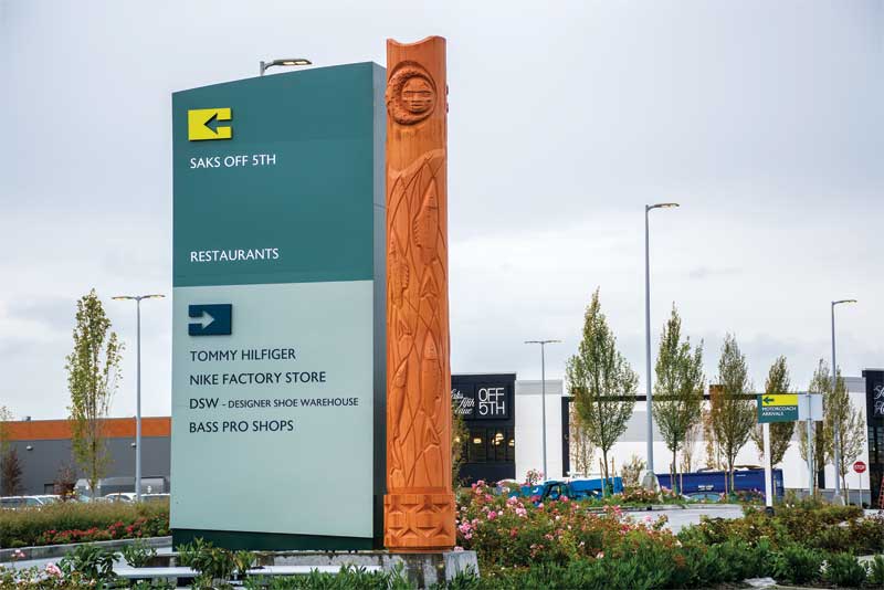
Taking inspiration from the Tsawwassen First Nation, exterior pylon signs were painted to resemble cedar wood and feature the local native language.
Like the artwork within the mall, the property’s identification (ID) signs took their inspiration from the Tsawwassen First Nation, with aluminum and fibreglass pylons painted to resemble the wood of local cedar trees and, on the back, featuring translations in the local native language.
“There are also pylons throughout the massive parking lot to direct customers to different parts of the mall, with specific graphics, numbers and letters for each parking area,” says Wlasichuk.
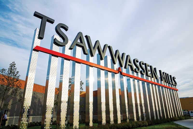
In between Knight Signs’ exterior and interior signs, which included some built for specific retail tenants, other contractors mounted large letters on aluminum-clad poles and installed the aforementioned art pieces.
“The place was busy right away,” Wlasichuk says. “With the tenant signs, which weren’t our main project, we had to wait until their own general contractors completed their store fittings before we could go in and install. That’s why there was a crunch for us at the end.”


