To achieve this level of clarity, each FID had to be not only highly visible, but also strategically located in an area where passengers were actually likely to look for information. With this in mind, Entro conducted extensive research into best practices for sorting information on FIDs at major airports around the world.
At the same time, Entro reviewed Calgary International Airport’s own previous FID system and found it was not as user-intuitive as it could be. In fact, there was congestion because passengers had to stand around the displays searching for their flight information for prolonged periods.
“What existed before was data sorted by time,” McTaggart explains. “This is not very intuitive to look through, especially since boarding and flight times are different.”
The solution to this problem was to sort flights instead by destination name. Clarity was also improved with stronger colour contrast and a better-planned hierarchy of information.
“We found this solution through our key studies and developed the information in a more logical way,” says McTaggart. “If someone is travelling to Vancouver, for instance, the information is sorted by destination, so they can find the city name on the display and then see all of the flights going there. And we’re using the traditional ‘go,’ ‘stop’ and ‘yield’ colours—flights that are on time are green, cancelled flights are red and delayed flights are yellow.”
Tests showed this system allowed passengers to locate relevant information much more easily than before.
“You almost don’t have to read it, it is so meaningful,” McTaggart says.
Another benefit of the call-to-gate system, meanwhile, is passengers have more time to enjoy the concourses’ hospitality and retail offerings before lining up for their flights, which makes for a more pleasurable, relaxing and comfortable customer experience. So, in addition to allowing the airport to receive a higher number of flights, the system helps promote business for its 50 dining, shopping and service options.
A bold approach to graphics
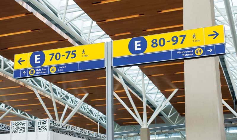
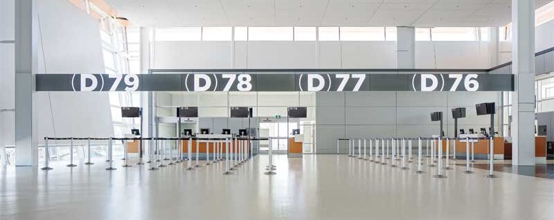
Given the opportunity to update its facility, the Calgary Airport Authority wanted a bolder take on signage and graphics, particularly since the call-to-gate system and the overall larger size of the airport require passengers to reach their gates quickly. Entro answered this request with clear, large-scale, easily readable ‘supergraphics’ to indicate each concourse and gate with bold letters and shapes that appear to extend beyond the edges of each sign.
The visual language of the graphics was kept consistent between static, digital and interactive signage. One of the challenges, however, was to avoid overloading passengers with sign clutter, as too many easily detectable graphics could lead to distraction and confusion. To ensure clarity with a minimum of signs, Entro used neutral white and silver hues, which work in contrast to and harmony with the blues and yellows used in other concourse signage, and illumination to promote legibility at a distance.
“Designing the gate signage in more blue and yellow would be overwhelming,” McTaggart explains. “By using neutral colours and more architectural touches and finishes, these graphics seem more permanent. They truly become part of the building.”
Indeed, studies showed many passengers feel reassured some visual components of the airport, including the gate numbers, are more ‘fixed’ than others.
“As part of our ‘cookie crumb’ strategy to lead passengers all the way to their final destination, those big moments are useful to tell them when they have arrived at their gate,” says McTaggart.
Despite the seeming permanency of the signs, they actually use a flexible system of acrylic panels with magnetic sheet backing, so they can be changed easily and inexpensively if needed.
The various components of the wayfinding system were fabricated by Knight Signs, which is headquartered in Delta, B.C., and has a local office within Calgary, and Swift Signs, based in Rockyview, Alta.


