Wayfinding: Case study on Calgary International Airport
by all | 28 March 2017 10:30 am
 [1]
[1]Photos courtesy Entro
By Cristina Kelly
On October 31, 2016, YYC Calgary International Airport opened its newest terminal to the public, the result of a major expansion that included two new concourses and 24 additional gates. The airport’s larger size will allow it to accommodate increasing numbers of flights to and from the U.S. and other international destinations, as well as facilitate a ‘hub-centric’ approach to improve efficiency and the passenger experience.
The Calgary Airport Authority’s original plan was to add facilities northward, but in the end, the expansion moved eastward instead. It is hoped to better position both the airport as a leader in Canada’s travel industry and the city of Calgary as an international hub unto itself. By way of example, a state-of-the-art baggage handling system could handle 4,000 arriving and 3,400 departing bags at once, with tracking and sorting capabilities to support compliance with international security requirements, but also to make flight connections easier for passengers. Designated areas would also allow passengers to check their own bags without the help of a dedicated attendee.
For the expanded airport, Toronto-based environmental graphic design (EGD) firm Entro provided a comprehensive sign program, spanning the parking garage, check-in halls, arrivals ‘meeter/greeter’ area, central departures area, security and customs facilities, baggage claim area, shops, restaurants, service areas and a variety of themed displays.
Dubbed the international facilities project, the expansion was the airport’s largest to date, with the new terminal adding some 185,806 m2 (2 million sf) to the total area. Entro began working with the project’s architects at Dialog’s Calgary office in 2007, when they were still in the early stages of master planning for the terminal.
As the scope of the project grew, Entro identified areas that would need to be modified accordingly, including signage for the YYC Link, a compact transit system between the old and new terminals. Also, the gates would have to be renumbered to accommodate the airport’s new master plan and architectural configuration.
For these reasons, Entro’s team was integrated into the overall strategy for retrofitting the airport.
A seamless system
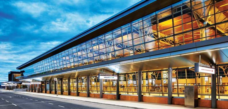
One of the primary objectives for Entro was to create a seamless system for passengers to navigate, from the roads leading to the airport to their final boarding gate.
“That experience was among our key considerations,” says Gord McTaggart, senior associate. “It was a question of how we could manage all of the interaction points with passengers, from when they arrive at the airport to when they board the plane. When done well, wayfinding refines that experience in a holistic and positive way.”
With a phased changeover for the airport’s concourses, there was a risk of confusing passengers during the transformation. So, during construction of the terminal, Entro’s work began with a transitional wayfinding system to ‘ease in’ some of the new elements of the facility and avoid problems. This involved rolling out new signs for roadways, parking areas, washrooms, gates and concourses.
Entro also played an advisory role in the full strategic implementation of the updated signage program for the entire airport, including the existing terminals. There were many stakeholders involved in the project, including the client organization at the executive and operational levels, the architects, construction managers and electricians, among others, all with their own scopes of work that overlapped with each other.
“One of the challenges was working with all of these entities to ensure a sign would be installed in the right location,” says McTaggart. “We provided quite a bit of co-ordination when it came to our specific goals.”
Another challenge was the need for a system-wide approach. Entro could not just focus on one area at a time, as there would be a ‘ripple effect’ any time a single sign was changed.
 [2]
[2]One of the primary objectives was to create a seamless system, from when passengers arrive through to their boarding gate.
Studies and the master plan
As mentioned, the eastward expansion required a new master plan for the layout and numbering of terminals and concourses. The gate renumbering process took place in 2014.
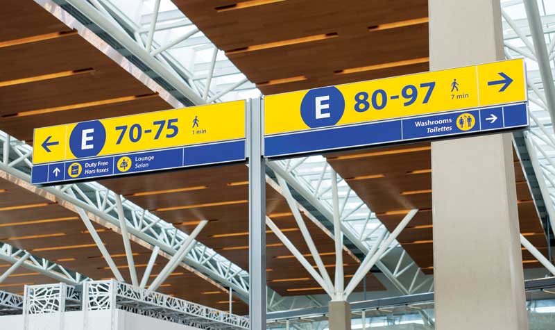
The terminals themselves were also redesignated, with Concourse C renamed Concourse A at the airport’s west entrance, then moving east to the new terminal’s Concourse D and Concourse E, which would open in 2016.
To determine the best strategy for indicating these changes with signage, Entro’s team—including designers Leah Ferguson and Raymundo Pavan and associate Chris Herringer—conducted an extensive process of preconstruction research and testing. This included talking to airport staff about any ‘pain points’ and existing issues that could be solved and observing passengers to check if they could easily and quickly understand information presented to them on signs.
There were also flow studies to find out how the passengers naturally moved throughout the airport, which would help Entro understand the optimal locations for sign placement. Accessibility studies, meanwhile, helped ensure the new wayfinding system would support ease of travel for physically, visually or otherwise impaired passengers.
“We can’t design in a vacuum,” says McTaggart. “Everything we do related to wayfinding is about the user group, i.e. the passengers. The more we can understand what their challenges are, the better we can design for these and create a more positive experience overall.”
The call-to-gate system
Along with the new terminal, Calgary Airport introduced the first call-to-gate system in Canada. Developed for passengers travelling to the U.S. and other destinations outside the country, the system is intended to prevent cluttering of the gates’ waiting areas and allow more flights to move in and out.
“The passengers wait in a common area and don’t know their gate number until the flight starts boarding,” explains Wayne McCutcheon, Entro’s partner in charge. “Clear communication is incredibly important because people have to be informed not only when their flight is called, but how far away their gate is.”
Rather than printing gate numbers onto passengers’ boarding passes, the airport designates the concourse name on each ticket. That concourse is where passengers do the majority of their waiting, until they are notified of their gate number.
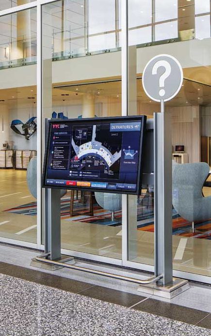
As such, wayfinding has a crucial role to play. The flight information displays (FIDs) that indicate flights’ gate numbers shortly before the boarding times must work cohesively and comprehensively with the call-to-gate system, gate podiums and gate identification signage throughout the entire airport, to ensure passengers receive clear directions and are not further confused by disjointed messaging.
 [3]
[3]Blue and yellow wayfinding signs lead visitors to the concourses, now redesigned A through E.
To achieve this level of clarity, each FID had to be not only highly visible, but also strategically located in an area where passengers were actually likely to look for information. With this in mind, Entro conducted extensive research into best practices for sorting information on FIDs at major airports around the world.
At the same time, Entro reviewed Calgary International Airport’s own previous FID system and found it was not as user-intuitive as it could be. In fact, there was congestion because passengers had to stand around the displays searching for their flight information for prolonged periods.
“What existed before was data sorted by time,” McTaggart explains. “This is not very intuitive to look through, especially since boarding and flight times are different.”
The solution to this problem was to sort flights instead by destination name. Clarity was also improved with stronger colour contrast and a better-planned hierarchy of information.
“We found this solution through our key studies and developed the information in a more logical way,” says McTaggart. “If someone is travelling to Vancouver, for instance, the information is sorted by destination, so they can find the city name on the display and then see all of the flights going there. And we’re using the traditional ‘go,’ ‘stop’ and ‘yield’ colours—flights that are on time are green, cancelled flights are red and delayed flights are yellow.”
Tests showed this system allowed passengers to locate relevant information much more easily than before.
“You almost don’t have to read it, it is so meaningful,” McTaggart says.
Another benefit of the call-to-gate system, meanwhile, is passengers have more time to enjoy the concourses’ hospitality and retail offerings before lining up for their flights, which makes for a more pleasurable, relaxing and comfortable customer experience. So, in addition to allowing the airport to receive a higher number of flights, the system helps promote business for its 50 dining, shopping and service options.
 [4]
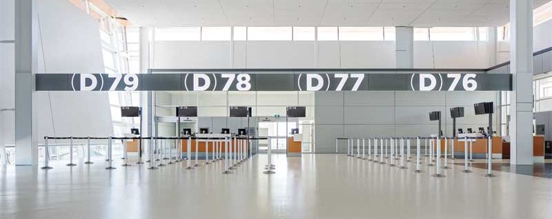
[4]Contrasting with the concourse signs, the gate signs themselves use neutral white and silver hues.
A bold approach to graphics
Given the opportunity to update its facility, the Calgary Airport Authority wanted a bolder take on signage and graphics, particularly since the call-to-gate system and the overall larger size of the airport require passengers to reach their gates quickly. Entro answered this request with clear, large-scale, easily readable ‘supergraphics’ to indicate each concourse and gate with bold letters and shapes that appear to extend beyond the edges of each sign.
The visual language of the graphics was kept consistent between static, digital and interactive signage. One of the challenges, however, was to avoid overloading passengers with sign clutter, as too many easily detectable graphics could lead to distraction and confusion. To ensure clarity with a minimum of signs, Entro used neutral white and silver hues, which work in contrast to and harmony with the blues and yellows used in other concourse signage, and illumination to promote legibility at a distance.
“Designing the gate signage in more blue and yellow would be overwhelming,” McTaggart explains. “By using neutral colours and more architectural touches and finishes, these graphics seem more permanent. They truly become part of the building.”
Indeed, studies showed many passengers feel reassured some visual components of the airport, including the gate numbers, are more ‘fixed’ than others.
“As part of our ‘cookie crumb’ strategy to lead passengers all the way to their final destination, those big moments are useful to tell them when they have arrived at their gate,” says McTaggart.
Despite the seeming permanency of the signs, they actually use a flexible system of acrylic panels with magnetic sheet backing, so they can be changed easily and inexpensively if needed.
The various components of the wayfinding system were fabricated by Knight Signs, which is headquartered in Delta, B.C., and has a local office within Calgary, and Swift Signs, based in Rockyview, Alta.
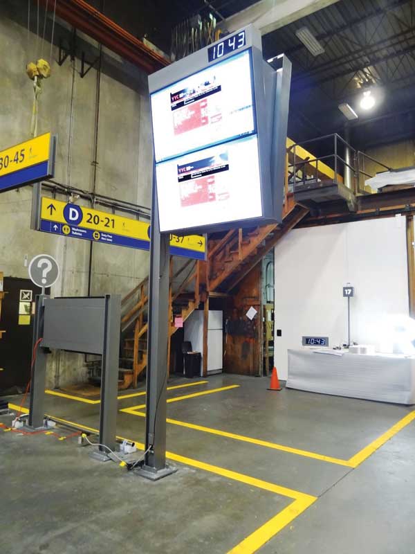 [5]
[5]Entro conducted extensive research into flight information displays (FIDs) before integrating them with the airport’s call-to-gate system, the first of its kind in Canada.
Timely transport
Among the many new features implemented to assist passengers in getting through Calgary International Airport with comfort and ease is, as mentioned earlier, the YYC Link, an inter-terminal transit system designed by GEC Architects to move people from concourse to concourse within the airport’s secure area. In addition to passengers and flight personnel, the compact shuttles carry customer care ambassadors who provide information to visitors about the airport, its services and Calgary attractions.
Entro developed a comprehensive wayfinding program for the YYC Link that both incorporates other airport signage standards and extends branding further. For reference, the team looked at how wayfinding information is provided in a graphic language in major subway systems.
“In a subway station, signs need to tell people both where they are and where they are going,” says McTaggart. “Typically, our research showed, the station you’re in is presented with a larger shape and the stations you’ve already visited are displayed in different colours from those you’re going to pass through next. With this in mind, we named the YYC Link stations A, B and C and used white, grey, and red signage in different shapes and sizes to indicate the passengers’ position within the system.”
This approach was based on the need for highly efficient, clear and functional signage.
“Airports have a huge time constraint, as everything is based on a flight schedule, so it is important to have clarity,” McCutcheon says. “Airports also have amenities, so when you get through, you have something to do, but flight times affect this, too. This is why the signage system needs to serve wayfinding needs within a very specific timeframe.”
As further phases of the compact transit system are worked through, Entro will continue retrofitting existing terminals with updated signage.
“We are proud to have been part of the international facilities project, bringing clarity to passengers and supporting a positive experience in their travels through the airport,” says McCutcheon.
Cristina Kelly is a communications and brand strategist for Entro. For more information, visit www.entro.com[6].
- [Image]: https://www.signmedia.ca/wp-content/uploads/2017/03/calgary_DZIVER-160917-_MG_9226-e1490379252617.jpg
- [Image]: https://www.signmedia.ca/wp-content/uploads/2017/03/calgary_569c89ac92ffe3926e6561199423d8de.jpg
- [Image]: https://www.signmedia.ca/wp-content/uploads/2017/03/calgary_528e89f697e4c69e0e6545c0a0c6b8b5.jpg
- [Image]: https://www.signmedia.ca/wp-content/uploads/2017/03/calgary_DZIVER-160915-_V0A3590_edit-e1490380222264.jpg
- [Image]: https://www.signmedia.ca/wp-content/uploads/2017/03/calgary_image20.jpg
- www.entro.com: http://www.entro.com
Source URL: https://www.signmedia.ca/wayfinding-case-study-on-calgary-international-airport/