
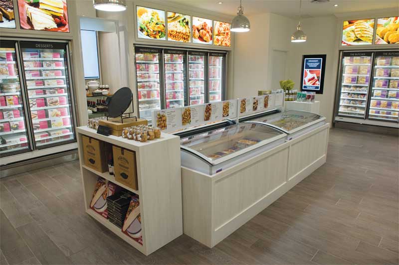
A neutral colour palette for walls and decor helps the graphics and packaging stand out better.
An aspirational approach
The design team identified several issues along M&M’s existing ‘path to purchase.’ With the aforementioned plain packaging, for example, the retailer relied heavily on mailing out colourful flyers to market its products to customers outside the stores. And once those customers were inside the store, they suddenly had to make their selections from a crowded menu board, a cumbersome binder or even the same weekly flyer, embedded underneath a polycarbonate countertop.
“Today’s customers are time-starved and may not have their meals planned,” says Dirstein. “We needed a new way to educate them about the products inside the plain boxes—and not just the items that happen to be on sale during a given week. So, we redesigned the packaging to allow customers to shop on their own.”
Improving the experience involved moving away from the order-taking model. The new approach involved complementing in-store graphics by assigning store staff as ‘meal advisors,’ to better engage with and support customers, showcase specific products and seasonal campaigns, introduce new features and suggest recipe ideas.
“We got rid of bottlenecks and now the staff is shoulder-to-shoulder with the customers,” Dirstein explains. “What used to be a functional, pragmatic experience is now more hands-on, personal and emotional. It’s like an aspirational kitchen. We want to inspire customers to become ‘pros’ in their own kitchens at home.”
From prototype to final concept
Two prototype concepts, referred to as ‘Kitchen’ and ‘Timely,’ were launched as test locations in September 2015 in Kitchener, Ont.—where M&M was founded—and then monitored. Both performed very well over the following four months, receiving extremely positive feedback from customers.
In the end, the final retail concept was mainly Kitchen, with some elements of Timely. It was launched in January 2016 in Burlington, Ont., before being rolled out to other locations.
The name change was publicly announced at a national level in March 2016, with the release of millions of new flyers, the redesigned website and new social media platforms.
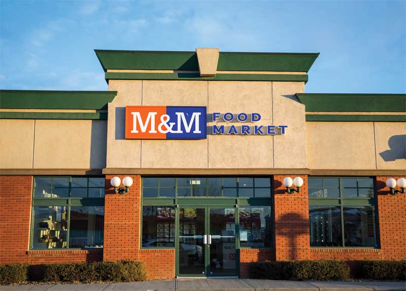
The most fundamental change was rebranding M&M Meat Shops as M&M Food Market
Photos courtesy M&M Food Market
The new stores feature signage and merchandising displays colour-coded by food category (e.g. meat, bread or dessert), corresponding to the design schemes of the new packaging.
“Imagery really drives the in-store atmosphere,” says Dirstein.
Full-colour photo-quality graphics help customers navigate more than 400 stock-keeping units (SKUs). Given the selection of these products varies with the size of each store, the sign system is scalable and modular. The graphics also appeal to customers’ appetite, of course, and dovetail with M&M’s slogan, ‘Helping You Make Real Food for Real Life.’
“We reshot all of the products and defined the colours for each department,” says Dirstein. “We also added a wayfinding menu for the front of the store. We wanted to design a stress-free shopping environment where customers could be inspired by great food stories.”


