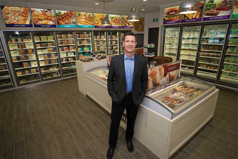
The plain white of the earlier packaging, meanwhile, now appears on the walls, along with grey and beige, to simulate the ideal clean kitchen space, illuminated by pendant-style lighting. The decor’s neutralized colour palette helps the graphics and packaging stand out better.
“The new designs really allow a lot more opportunity for our food to be the hero,” says Allan Lindsay, M&M’s vice-president (VP) of marketing and technical services. “Shikatani Lacroix designed a more contemporary and accessible retail concept, from the stores to the packaging to the online experience.”
One of the prototype stores had featured interactive digital signage to help customers mix and match ingredients.
“While these screens were not carried forward into the rebranded stores, their functionality got picked up instead for the website, which helps customers with meal planning,” says Dirstein.
A national rollout
The updated design continues to be rolled out to both new and existing M&M stores across the country. When it reached Lloydminster, Alta., for example, rather than renovate the city’s 111.5-m2 (1,200-sf) store, the franchisee moved her business down the road into a new 232-m2 (2,500-sf) location, the biggest store with the new branding anywhere in Canada, which opened in August 2016.
“Every owner can’t wait to get his/her store updated and transformed,” says Dirstein. “They understand the need to look ahead to stay competitive.”
The design firm developed a standards manual that M&M’s internal teams will continue to follow for future projects.
“Shikatani Lacroix took a holistic approach to the entire design,” says M&M’s O’Brien. “It’s seamless.”
With files from Shikatani Lacroix and M&M Food Market. For more information, visit www.sld.com and www.mmfoodmarket.com.


