Wayfinding: Case study on M&M Food Market
by all | 2 August 2017 10:36 am
 [1]
[1]Photos courtesy Shikatani Lacroix
By Peter Saunders
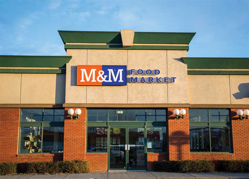
When Canadian frozen-food retailer M&M Meat Shops was recently rebranded as M&M Food Market, one major component of this transformation was implementing a ‘self-serve’ shopping model for its stores. Where customers had previously placed their orders with staff at a counter, now they would instead retrieve the products from the freezers on their own. As such, wayfinding graphics became important elements of the retailer’s interior decor for the first time.
Time for a change
M&M was acquired by Search Light Capital in 2014. Along with this change in ownership, it became clear the organization would have to make some other changes to continue to remain relevant in the marketplace by attracting and meeting the needs of a new generation of customers.
M&M’s brand was new and innovative when it was launched in 1980. Nearly 35 years later, it had certainly become well-entrenched across the country, with more than 340 locations and eight million loyalty club members, but it had not changed much and was seeing a decline in traffic.
The notion of the ‘castle wall’ between the staff and the customers was outdated, long since abandoned by many other retailers, and the plain ‘no-name’ packaging—all white, with blue type—was a missed opportunity in terms of visual branding.
“Our research found M&M wasn’t top-of-mind for Canadians when it came to everyday foods,” says Andy O’Brien, the retailer’s president and CEO.
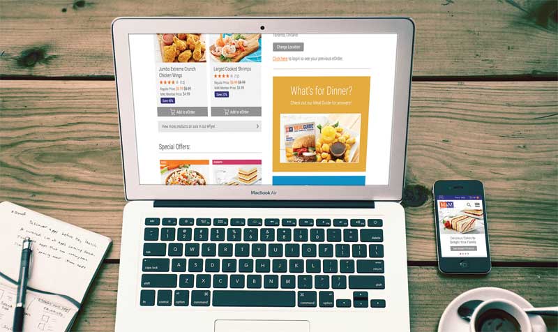 [2]
[2]Interactive digital signage did not make it past the prototype store phase, but led the way for the redesigned website.
Market disruption
Toronto-based graphic design firm Shikatani Lacroix was brought on-board to work alongside market research agency Sklar Wilton & Associates, advertising firm Riddoch Communications and customer experience (CX) agency Fifth P to support M&M’s transformative reinvention. Their research and development (R&D) efforts included designing a new logo and website, creating new staff uniforms, reimagining the frozen food packaging and, as mentioned, devising a modernized store concept.
“We began working with their senior management team in early 2015, reviewing what was going on in the food retail market,” says Richard Dirstein, principal and executive vice-president (EVP) of design and innovation for Shikatani Lacroix. “This involved looking at how frozen food was sold elsewhere. The market had evolved significantly and, while M&M was still adding great new products, the CX was lacking. They wanted to be disruptive in this respect.”
“The longstanding practice of over-the-counter service did not allow customers to explore the full range of products,” adds Jean-Pierre Lacroix, president of Shikatani Lacroix. “It was time to put control in their hands.”
The challenge, however, was to modernize the stores without alienating the significant existing customer base, while meeting the needs of the franchisees and other stakeholders.
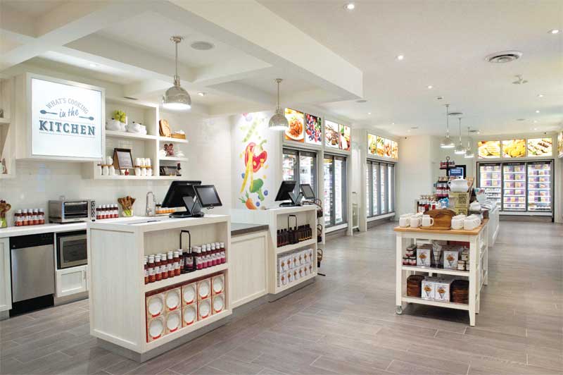
 [3]
[3]A neutral colour palette for walls and decor helps the graphics and packaging stand out better.
An aspirational approach
The design team identified several issues along M&M’s existing ‘path to purchase.’ With the aforementioned plain packaging, for example, the retailer relied heavily on mailing out colourful flyers to market its products to customers outside the stores. And once those customers were inside the store, they suddenly had to make their selections from a crowded menu board, a cumbersome binder or even the same weekly flyer, embedded underneath a polycarbonate countertop.
“Today’s customers are time-starved and may not have their meals planned,” says Dirstein. “We needed a new way to educate them about the products inside the plain boxes—and not just the items that happen to be on sale during a given week. So, we redesigned the packaging to allow customers to shop on their own.”
Improving the experience involved moving away from the order-taking model. The new approach involved complementing in-store graphics by assigning store staff as ‘meal advisors,’ to better engage with and support customers, showcase specific products and seasonal campaigns, introduce new features and suggest recipe ideas.
“We got rid of bottlenecks and now the staff is shoulder-to-shoulder with the customers,” Dirstein explains. “What used to be a functional, pragmatic experience is now more hands-on, personal and emotional. It’s like an aspirational kitchen. We want to inspire customers to become ‘pros’ in their own kitchens at home.”
From prototype to final concept
Two prototype concepts, referred to as ‘Kitchen’ and ‘Timely,’ were launched as test locations in September 2015 in Kitchener, Ont.—where M&M was founded—and then monitored. Both performed very well over the following four months, receiving extremely positive feedback from customers.
In the end, the final retail concept was mainly Kitchen, with some elements of Timely. It was launched in January 2016 in Burlington, Ont., before being rolled out to other locations.
The name change was publicly announced at a national level in March 2016, with the release of millions of new flyers, the redesigned website and new social media platforms.
 [4]
[4]The most fundamental change was rebranding M&M Meat Shops as M&M Food Market
Photos courtesy M&M Food Market
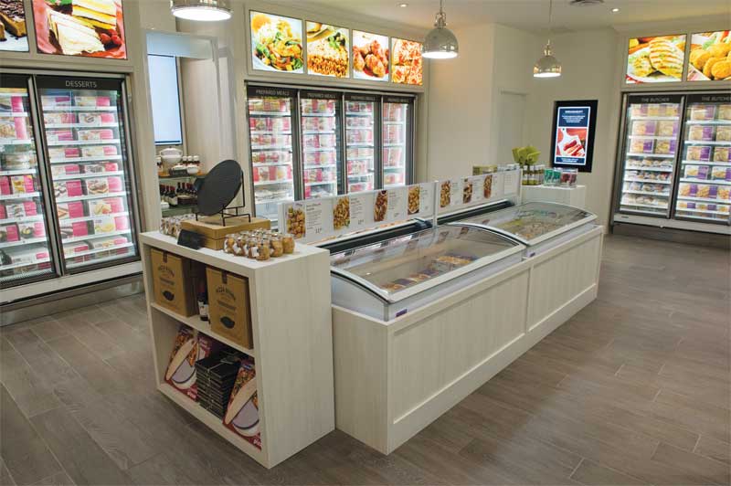
The new stores feature signage and merchandising displays colour-coded by food category (e.g. meat, bread or dessert), corresponding to the design schemes of the new packaging.
“Imagery really drives the in-store atmosphere,” says Dirstein.
Full-colour photo-quality graphics help customers navigate more than 400 stock-keeping units (SKUs). Given the selection of these products varies with the size of each store, the sign system is scalable and modular. The graphics also appeal to customers’ appetite, of course, and dovetail with M&M’s slogan, ‘Helping You Make Real Food for Real Life.’
“We reshot all of the products and defined the colours for each department,” says Dirstein. “We also added a wayfinding menu for the front of the store. We wanted to design a stress-free shopping environment where customers could be inspired by great food stories.”
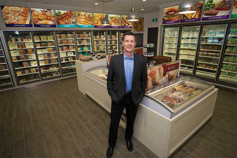 [5]
[5]Andy O’Brien, M&M’s president and CEO, describes the design approach as holistic and seamless.
The plain white of the earlier packaging, meanwhile, now appears on the walls, along with grey and beige, to simulate the ideal clean kitchen space, illuminated by pendant-style lighting. The decor’s neutralized colour palette helps the graphics and packaging stand out better.
“The new designs really allow a lot more opportunity for our food to be the hero,” says Allan Lindsay, M&M’s vice-president (VP) of marketing and technical services. “Shikatani Lacroix designed a more contemporary and accessible retail concept, from the stores to the packaging to the online experience.”
One of the prototype stores had featured interactive digital signage to help customers mix and match ingredients.
“While these screens were not carried forward into the rebranded stores, their functionality got picked up instead for the website, which helps customers with meal planning,” says Dirstein.
A national rollout
The updated design continues to be rolled out to both new and existing M&M stores across the country. When it reached Lloydminster, Alta., for example, rather than renovate the city’s 111.5-m2 (1,200-sf) store, the franchisee moved her business down the road into a new 232-m2 (2,500-sf) location, the biggest store with the new branding anywhere in Canada, which opened in August 2016.
“Every owner can’t wait to get his/her store updated and transformed,” says Dirstein. “They understand the need to look ahead to stay competitive.”
The design firm developed a standards manual that M&M’s internal teams will continue to follow for future projects.
“Shikatani Lacroix took a holistic approach to the entire design,” says M&M’s O’Brien. “It’s seamless.”
With files from Shikatani Lacroix and M&M Food Market. For more information, visit www.sld.com[6] and www.mmfoodmarket.com[7].
- [Image]: https://www.signmedia.ca/wp-content/uploads/2017/07/MM-Meat-Shops-01.jpg
- [Image]: https://www.signmedia.ca/wp-content/uploads/2017/07/MM-Website-Laptop.jpg
- [Image]: https://www.signmedia.ca/wp-content/uploads/2017/07/MM-Meat-Shops-04.jpg
- [Image]: https://www.signmedia.ca/wp-content/uploads/2017/07/MMFood-1339.jpg
- [Image]: https://www.signmedia.ca/wp-content/uploads/2017/07/Andy-4_1482.jpg
- www.sld.com: http://www.sld.com
- www.mmfoodmarket.com: http://www.mmfoodmarket.com
Source URL: https://www.signmedia.ca/wayfinding-case-study-on-mm-food-market/