
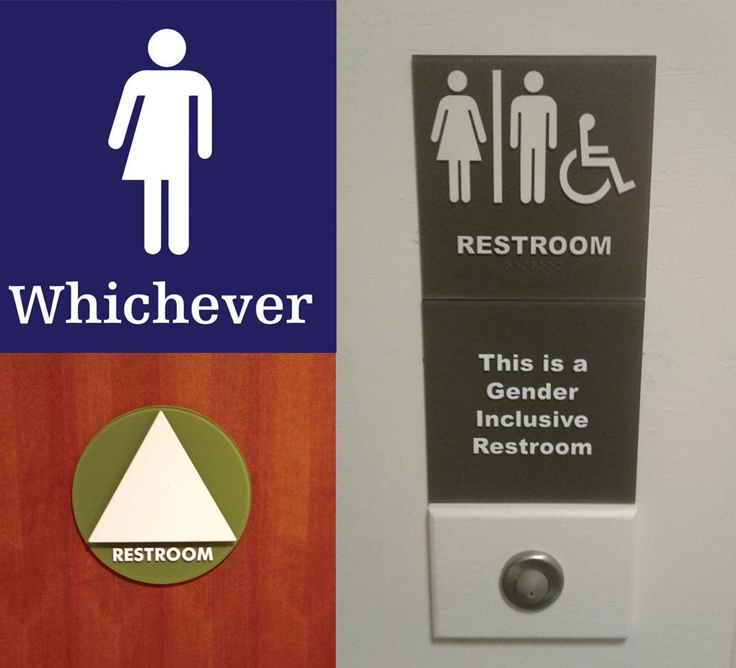
There have been numerous design approaches in recent years for inclusive washroom signage.
File images
The broader context
Bill C-16, An Act to Amend the Canadian Human Rights Act and the Criminal Code, was introduced in Parliament on May 17, 2016. This year, it passed a vote in the Senate and received royal assent, paving the way for it to become law. It will add “gender expression or identity” as a protected ground to the Canadian Human Rights Act and to existing provisions in the Criminal Code that deal with hate propaganda, incitement to genocide and aggravating factors in sentencing.
The goal of the law is to ensure all Canadians can identify and express their gender without suffering from discrimination. Most of the provinces and territories have already updated their human rights legislation to include such protection and similar legislation has been at the forefront of social developments around the world, but Canada has a unique opportunity with the bill to continue support for tolerant rhetoric through both legislation and community advocacy.
This is not the first time washrooms have been a focus of political debate, nor the first time graphic design has helped to solve social and political challenges. At the root of this subject is the messaging used on signage, including both wording and pictograms. While some people may assume the nature of an image on a washroom door or directional sign is not important or does not have much effect, sign designers know pictograms are actually powerful tools with respect to people’s cognitive systems. The choice of words and symbols helps define the way a society communicates.
“Signage is powerful,” says McCutcheon at Entro. “We know that very well, as we work in this industry, but those outside of it may not understand how it can affect people psychologically. We have the ability to influence our clients’ decisions at key points in the design process. While we were already recommending inclusive washroom signage, we felt it was crucial to get the same information out to other organizations that could benefit from it, as well as the public.”
With this intent, Entro put forward a series of guiding principles for the transition to inclusive washroom signage.
Focusing on service, not identity
With inclusive washrooms becoming required in more and more facilities, designers often ask which is the most appropriate way to display multiple gender identities on one sign. The answer is not to do so at all, but instead take
a design cue from a key principle that relates
to all signage: the simpler the icon, the better.
By not focusing on identities, signage can instead focus on the service provided, as it does in other scenarios. When only certain gender-associated icons are displayed on a sign, certain groups receive the message they cannot access the related service or it simply does not apply to them; but if the service itself is portrayed instead, i.e. with a simple pictogram of a toilet, then there is no risk of identity-based exclusion.
After all, countless other services—from public transportation to waste management—are identified with signs that do not need to display their users’ identities, but instead rely on simple icons representing those services. No one identifies themselves by gender when taking a bus or throwing garbage into a trash can.
It is important to realize, contrary to popular belief, gender identity is not relevant to washroom use, either. Visiting a single-use washroom is no different from partaking in any other common public services and, therefore, does not require gender identification on the door.
Signage should not emphasize the person walking through the door, but rather focus on the service that person is seeking to use.
Keeping communication clear
Following this same principle of simplicity further, it is best to include only the elements that are needed to convey a message. This is especially true for individuals who cannot read the local language and/or are vision-impaired.
As past experience with sign design shows, to be understood quickly and easily, pictograms need to be easily distinguishable from their background and surroundings and contain as little detail as possible. Following this principle, Entro recommended a sign featuring the word ‘washroom,’ the toilet pictogram and—where applicable with respect to physical accessibility—the already well- established wheelchair pictogram. This is where simplicity is particularly beneficial to design, as multiple pieces of necessary information can be conveyed without overcrowding the sign. Navigation is made easier when individuals can quickly identify (a) the service and (b) their ability to access it.


