
Photos courtesy Entro
By Vincent Matthieu Gratton
The Viva bus rapid transit (BRT) service for Ontario’s York Region, just north of Toronto, was officially launched by York Region Transit (YRT) in September 2005. Since it began operations, the express service has gradually been expanded through the addition of several ongoing projects, each of which represents a different phase in the development of an entire transit system. Entro, a Toronto-based environmental graphic design (EGD) firm, has been involved in developing this system’s visual identity and signage programs since its inception.
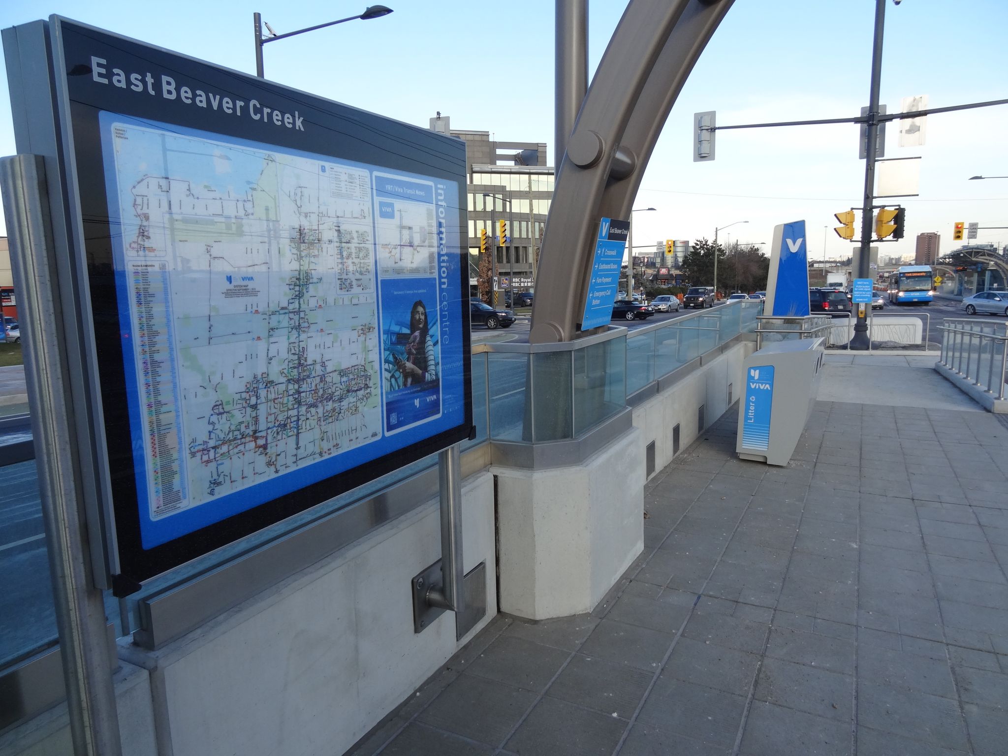
Most recently, Viva graphics have been refreshed for the ‘VivaNext’ series of dedicated busways, including new designs for identity signs, wayfinding signs, fare equipment, emergency call boxes, digital signage, environmental graphics, safety signage and electronic variable-message signs (VMSs)—which display bus arrival information, updated in real time—at platforms, towers and stations.
True blue designs
York Region’s ambition has been to create a first-class regional transit system and customer experience to attract passengers who would otherwise need to travel by car across the primarily suburban environment. So, over the years, Entro has worked to address every aspect of these users’ expectations within the context of visual identity and architectural design.
From the time customers leave their home to the moment they arrive at their destination, after all, their experience will involve many elements, including signage, architecture, infrastructure, communications and the quality of public spaces. Navigating the transit system should be intuitive, seamless and efficient, enhanced by identity and wayfinding graphics.
It was determined that designs for signs, fare equipment, bus graphics and architectural components would reflect the angularity of the Viva wordmark.
With this in mind, Entro originally developed a visual system for Viva’s QuickStart phase to convey a logo, a name and a message through branding and ‘experiential’ communications, to create anticipation for the new, progressive transit system. A dynamic, innovative approach was needed to reflect modernity, reliability and excitement in a way that would be unique to York Region.
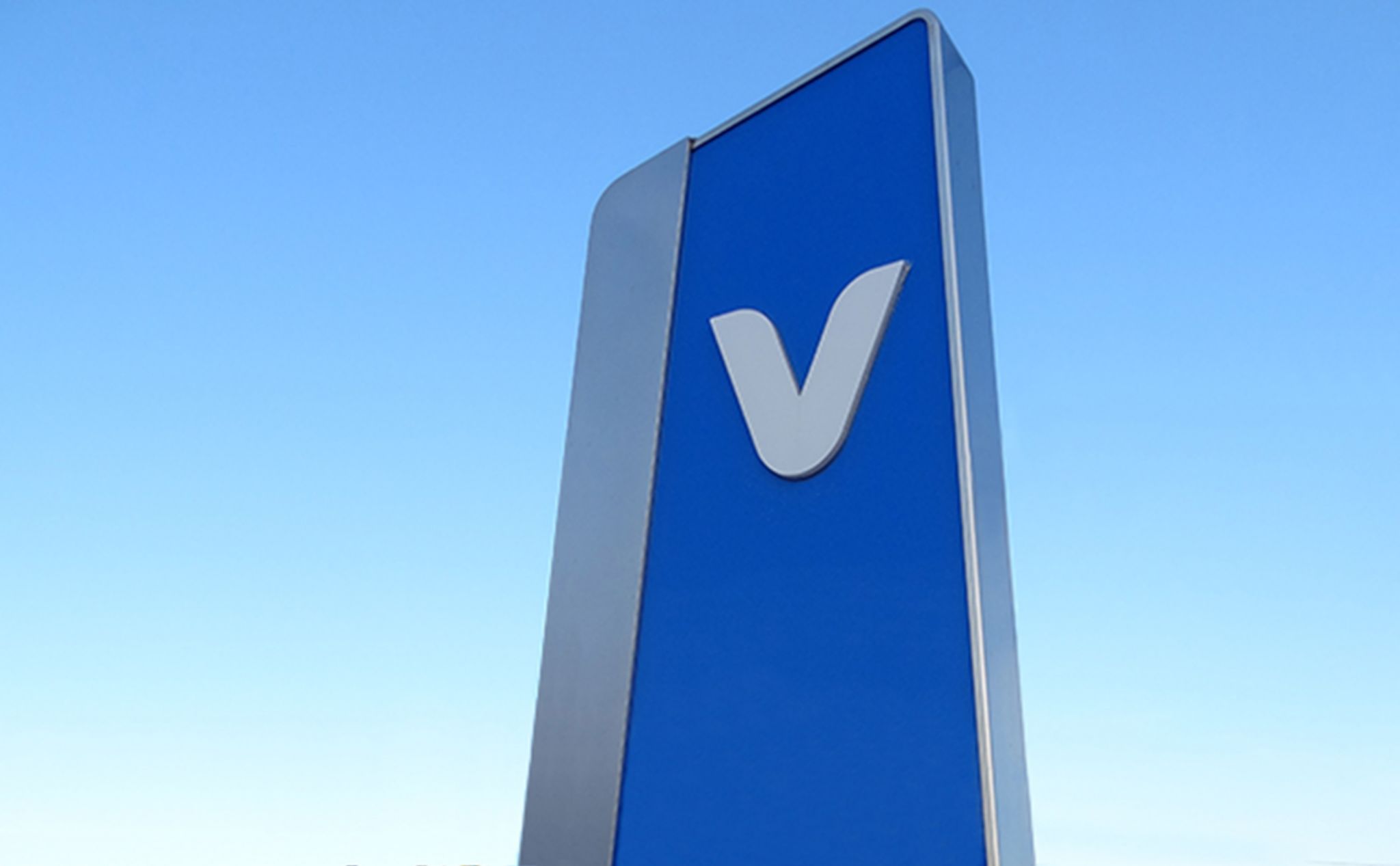
Entro then extended this identity to a range of applications to ensure a visually comprehensive system, including the Viva buildings, bus shelters, signs, kiosks and both interior and exterior livery (i.e. design and paint scheme for its vehicles), as well as uniforms, schedules, printed collateral and online media. A blue corporate colour was carried through all identity elements and the designs for signs, fare equipment, bus graphics and architectural components all reflected the angularity of the Viva wordmark.


