Wayfinding: Pointing to the future of transit
by all | 23 June 2014 1:30 pm
 [1]
[1]Photos courtesy Entro
By Vincent Matthieu Gratton
The Viva bus rapid transit (BRT) service for Ontario’s York Region, just north of Toronto, was officially launched by York Region Transit (YRT) in September 2005. Since it began operations, the express service has gradually been expanded through the addition of several ongoing projects, each of which represents a different phase in the development of an entire transit system. Entro, a Toronto-based environmental graphic design (EGD) firm, has been involved in developing this system’s visual identity and signage programs since its inception.
Most recently, Viva graphics have been refreshed for the ‘VivaNext’ series of dedicated busways, including new designs for identity signs, wayfinding signs, fare equipment, emergency call boxes, digital signage, environmental graphics, safety signage and electronic variable-message signs (VMSs)—which display bus arrival information, updated in real time—at platforms, towers and stations.
True blue designs
York Region’s ambition has been to create a first-class regional transit system and customer experience to attract passengers who would otherwise need to travel by car across the primarily suburban environment. So, over the years, Entro has worked to address every aspect of these users’ expectations within the context of visual identity and architectural design.
From the time customers leave their home to the moment they arrive at their destination, after all, their experience will involve many elements, including signage, architecture, infrastructure, communications and the quality of public spaces. Navigating the transit system should be intuitive, seamless and efficient, enhanced by identity and wayfinding graphics.
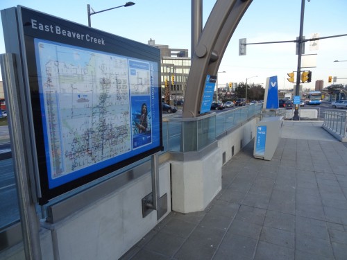
 [2]
[2]It was determined that designs for signs, fare equipment, bus graphics and architectural components would reflect the angularity of the Viva wordmark.
With this in mind, Entro originally developed a visual system for Viva’s QuickStart phase to convey a logo, a name and a message through branding and ‘experiential’ communications, to create anticipation for the new, progressive transit system. A dynamic, innovative approach was needed to reflect modernity, reliability and excitement in a way that would be unique to York Region.
Entro then extended this identity to a range of applications to ensure a visually comprehensive system, including the Viva buildings, bus shelters, signs, kiosks and both interior and exterior livery (i.e. design and paint scheme for its vehicles), as well as uniforms, schedules, printed collateral and online media. A blue corporate colour was carried through all identity elements and the designs for signs, fare equipment, bus graphics and architectural components all reflected the angularity of the Viva wordmark.
The next generation
The blue colour and angularity both remain part of Viva’s visual identity to this day, but with the development of the VivaNext projects—which will include not only the aforementioned busways, but also light-rail transit (LRT) lines and extensions of Toronto Transit Commission (TTC) subway lines—has come a need to ‘refresh’ the look and feel of Viva’s existing signage and graphics. This has involved updates to a variety of wayfinding products and systems, which Entro was commissioned in 2011 to design.
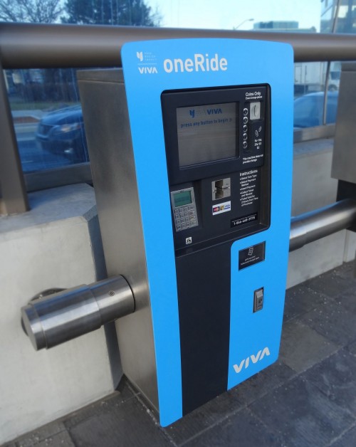 [3]
[3]The fare-payment machines’ design was updated for minimal space requirements, modularity, dynamic load conditions and durability.
The project required a multidisciplinary work approach, from the industrial design of various new products to the structural design of site identification signs to the graphic design of wayfinding messages.
All of the service platforms, stations and towers along the dedicated busways feature new more modernized architectural designs, with a curved blue glass canopy stretching along the length of the platforms and stations. Since the signage updates were intended to reflect this style, materials similar to those used for the new bus platforms were chosen for the signs, to complement the architectural work.
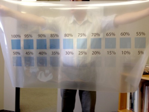
Entro primarily used blue polycarbonate and stainless steel to create the main ‘fin’ signs that serve to identify each VivaNext station. These signs are the first point of contact for customers, so their visibility is crucial to the program’s success.
One of the major challenges, given the identification signs had to remain effective during both daytime and nighttime hours, was to determine the best number and most visible colours of vinyl films—which would be sandwiched in the polycarbonate—for both illuminated and non-illuminated viewing conditions. Illumination can severely affect the perceived colours of vinyl films, so extensive testing was required to find the best combination of materials.
WSI Sign Systems, based in Bolton, Ont., was tasked with fabricating and installing the station identity signs. Meanwhile, Zip Signs in Burlington, Ont., was tasked with fabricating and installing on-platform signage.
The blue glass was carried into many of the products. Also, due to the limited floor space available on the dedicated busway platforms, one of the most challenging aspects of the project was determining how to mount the signs, fare equipment and graphic elements onto the curved glass structures. In the end, Entro designed many of these products with curved elements, such that they could conform to the curved glass walls. And in conditions where it was impossible to mount products directly to the glass—due to either structural or esthetic concerns—alternative installation methods were devised.
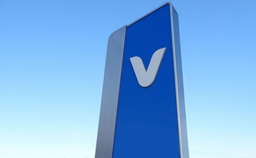
 [4]
[4]It was also important to match Viva’s corporate blue colour scheme.
Fare-minded
Entro was also called upon to develop a new design for the VivaNext fare equipment, which allows passengers to buy a ticket before they board the buses. (YRT introduced this proof-of-payment scheme for Viva from the start, to speed up boarding.)
To maintain consistency across the system, the same fare-payment technology used in the older Viva equipment was adopted for the new machines, but Entro was tasked with updating them, both in terms of minimizing their size for installation on narrower platforms and in terms of complementing the new branding and architecture. So, the aim was to make the equipment slender and sleeker, while incorporating some of the VivaNext architectural features to create a unified design.
There were other aspects of the project, however, that posed additional challenges. For one thing, the design intent was to develop a product that could easily be modified in the future if needed. So, provisions were included in the final mounting designs to allow the equipment to be moved or repositioned, in the event additional equipment is required in the future.
Secondly, the weight of the machines would vary depending on the number of coins inserted in them. In fact, the weight difference between an empty machine and a full machine can be as much as 272 kg (600 lb). The structural elements of the design had to accommodate for these dynamic load conditions.
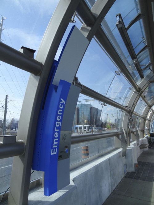 [5]
[5]Entro designed emergency call boxes and other components with curved elements, so they could conform to the curved glass walls.
As such, this was one of the cases where equipment could not be mounted directly to the curved glass. Instead, it was designed to be attached to an adjustable steel post system, which in turn was mounted to a concrete knee-wall, with sufficient turning radius for passengers in wheelchairs. The heights and spacing of button controls were also specified with accessibility requirements in mind.
Finally, fare machines are often subject to vandalism and breakdowns, so maintenance would be an important consideration. The VivaNext fare equipment had to be durable but also serviceable, which called for ease of uninstallation and removal to allow for on-site replacement and off-site maintenance. The post system on which the machines are mounted was designed with this flexibility in mind.
After Entro completed the industrial and graphic design of the machines, they were fabricated by Cubic, which is headquartered in San Diego, Calif., and operates a Canadian regional transportation systems office in Concord, Ont.
Guarding the brand
Having completed work for both the original QuickStart project and the ongoing VivaNext phases, Entro has become Viva’s ‘brand guardian’ of sorts, continually consulted to ensure the system’s visual identity and equipment designs are applied consistently across various elements of the built environment.
The first dedicated busways are now active along Highway 7 in Richmond Hill and Markham, Ont. Future sections are under construction and/or planned in Vaughan and Newmarket, Ont., over the next five years.
Vincent Matthieu Gratton is an associate for Entro. For more information, contact him via e-mail at vincent@entro.com[6].
- [Image]: http://www.signmedia.ca/wp-content/uploads/2014/05/Illuminated-Map-Sytem.jpg
- [Image]: http://www.signmedia.ca/wp-content/uploads/2014/05/1.jpg
- [Image]: http://www.signmedia.ca/wp-content/uploads/2014/05/3.jpg
- [Image]: http://www.signmedia.ca/wp-content/uploads/2014/05/Colour-Determination.jpg
- [Image]: http://www.signmedia.ca/wp-content/uploads/2014/05/Emergency-Call-Box.jpg
- vincent@entro.com: mailto:%20vincent@entro.com
Source URL: https://www.signmedia.ca/wayfinding-pointing-to-the-future-of-transit/