
Wayfinding flow
For the first half-year, Entro’s team studied existing conditions, particularly with regard to traffic flow through the station’s many entry points and, of course, inconsistencies among both heritage and more recent signage. The existing signs did not share a common language in terms of graphic hierarchy, logo use and destination terminology. The station’s various tenants—including not only the railway operators, but also retail shops, car rental agencies and restaurants—had put up their own directional signs over time without working together on any comprehensive wayfinding plan.
Based on existing station plans and its own pedestrian traffic studies, Entro developed a series of wayfinding flowcharts to list all major pedestrian access routes to and from transit.
“We had to define the wayfinding routes and sign locations before we could develop standards for message sizes based on viewing distance,” explains Randy Johnson, senior associate at Entro. “It was the most complicated project I’ve ever worked on.”
Accessibility
Another important area of study was accessibility. Given the large numbers and diversity of Union Station’s passengers, Entro considered the needs of low-vision, mobility-impaired and non-English/French-speaking users. The company also had to coalesce GO Transit, Via and TTC signage guidelines into its best practices.
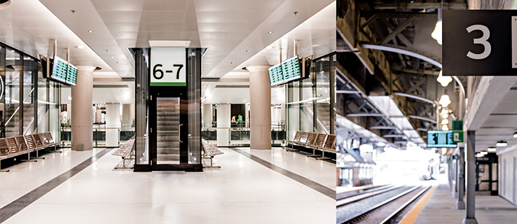
Among the changes to the station are new staircases and train platforms, all of which needed to be clearly indicated to regular passengers.
After studying the issue, Entro determined its functional solution would be to use white text in a Clearview typeface on a dark grey background—providing a contrast level greater than 70 per cent—for all primary wayfinding and identity signage, with a minimum letter height of 75 mm (3 in.). A blue background would indicate wheelchair-accessible routes. Braille dots and tactile characters would be key elements on signs within reach. And moving beyond signs, the company would help develop an accessible website with trip pre-planning tools.
Heritage in design
Entro’s sign designs also had to be informed by Union Station’s heritage designation, as enforced by Parks Canada. This means any installation of new signs must be sensitive to the integrity of the building’s surfaces and finishes, with as few drill holes as possible, ensuring they can be removed at some point in the future without causing damage.
In addition to Parks Canada, the project required co-ordination with and buy-in from other stakeholders, including the municipal government, Metrolinx and GO, Via, the TTC and several nearby commercial and tourism attractions, including the Fairmont Royal York Hotel and, perhaps most notably, the Air Canada Centre (ACC), which is directly attached to the station and draws more traffic than any other single ‘tenant.’
With all of these factors in mind, Entro’s team decided to echo the motif of Union Station’s grand pillars in a series of rectangular sign ‘modules’ framed in decorative elements, which would be installed upright at key decision points throughout the facility. Elsewhere, overhead directional sign modules would be ceiling-mounted with as few attachments points as possible, in horizontal configurations. And outdoors, large letters would spell out ‘Union Station’ at both the east and west ends of the building.
Parks Canada approved Entro’s preliminary, fixed and technical drawings throughout the design process, which wrapped up in late 2012.


