Wayfinding Systems: Uniting Union Station
by all | 4 November 2015 11:31 am
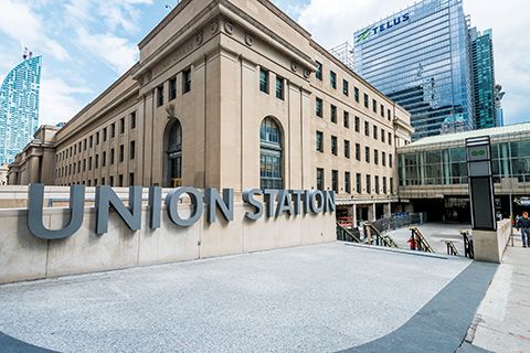 [1]
[1]Photos courtesy Entro
By Peter Saunders
More than six years in the planning, the installation of new wayfinding signs in Toronto’s iconic Union Station—Canada’s busiest transportation hub, with an average of more than 250,000 people passing through every day—finally began this summer. The sign system is a unifying part of the facility’s major revitalization, which began with preliminary architectural designs in 2007 and should be substantially completed by 2018.
Overdue for expansion
Union Station’s construction was commissioned by Canadian Pacific (CP) Railway and Grand Trunk Railways. The building opened in 1927 and was designated a national historic site in 1975, named a heritage railway station in 1989 and inducted into the North America Railway Hall of Fame in 1999.
Today, under the ownership of Toronto’s municipal government and provincial crown agency Metrolinx’s GO Transit system, named for the Government of Ontario (GO), it is a bustling nexus of three major rail systems: GO’s regional commuter train network, Via Rail Canada’s intercity passenger train services and the Toronto Transit Commission’s (TTC’s) adjoining Yonge-University-Spadina subway line. GO’s passenger numbers are expected to double over the next 20 years as services are expanded; 50 per cent of all Via passengers use the station; and it is the fourth busiest station within the TTC system.
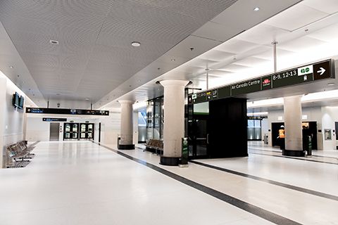 [2]
[2]The station’s expanded York Street Concourse opened earlier this year.
Union Station also facilitates a recently revitalized, dedicated right-of-way TTC streetcar line along Toronto’s Queens Quay (connecting to GO’s Exhibition Station), the Maple Leaf train line to the U.S. (jointly operated by Via and Amtrak) and the new Union-Pearson (UP) Express train, which accelerates trips to Toronto’s Pearson International Airport.
With all of these services and a direct connection to a GO bus terminal, Union Station already handles twice as many passengers annually as Pearson, which is Canada’s largest and busiest airport. Unlike that airport’s terminals, however, Union Station has not grown to accommodate its increasing ridership levels. It has also recently showed signs of its age, including leaky roofs, peeling paint and cracked floors.
These problems are finally being remedied with the ongoing Union Station revitalization, which is adding new platforms, concourses, staircases, escalators, elevators, bicycle racks and access points, restoring historic lounges, offices and restrooms and, according to Metrolinx, expanding the gross floor area from 76,366 m2 (822,000 sf) to 86,957 m2 (936,000 sf), GO’s concourses from 2,787 m2 (30,000 sf) to 10,219 m2 (110,000 sf) and the station’s commercial retail space from 3,252 m2 (35,000 sf) to 15,329 m2 (165,000 sf). One major challenge has been the need to keep the station open 24-7 during these changes.
A rare opportunity
With the revitalization of Union Station has come a rare chance to rethink signage around and throughout the multi-use facility. Previously, signs were implemented in scattershot fashion by individual parties, rather than with a unified vision.
Perhaps most tellingly, the station was utterly lacking in large-scale identity signage; for regular passengers, it was simply recognizable by its architecture and reached by way of its various tenants’ own logos and directional signs.
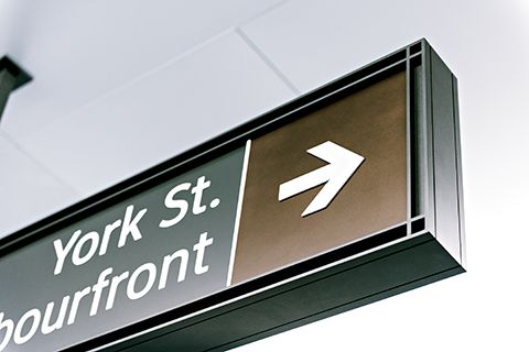 [3]
[3]The use of white Clearview text and symbols on a dark background provides a contrast level greater than 70 per cent.
Toronto-based environmental graphic design (EGD) firm Entro was hired in 2009 by Neish, Owen, Rowland & Roy (NORR) Limited Architects & Engineers—which designed the renovated facility—and the Redcliff Realty Group—which will manage its new commercial retail spaces—to develop a comprehensive signage program for the main building, transit concourses, shopping/eating areas and exterior. In the architectural vision for the expanded station, full of open, airy and bright indoor spaces, Entro’s team of designers seized the opportunity to integrate clean lines and uncluttered graphics into the building for clearer navigation and, outside, to finally brand the station with its own identity signage.
Wayfinding flow
For the first half-year, Entro’s team studied existing conditions, particularly with regard to traffic flow through the station’s many entry points and, of course, inconsistencies among both heritage and more recent signage. The existing signs did not share a common language in terms of graphic hierarchy, logo use and destination terminology. The station’s various tenants—including not only the railway operators, but also retail shops, car rental agencies and restaurants—had put up their own directional signs over time without working together on any comprehensive wayfinding plan.
Based on existing station plans and its own pedestrian traffic studies, Entro developed a series of wayfinding flowcharts to list all major pedestrian access routes to and from transit.
“We had to define the wayfinding routes and sign locations before we could develop standards for message sizes based on viewing distance,” explains Randy Johnson, senior associate at Entro. “It was the most complicated project I’ve ever worked on.”
Accessibility
Another important area of study was accessibility. Given the large numbers and diversity of Union Station’s passengers, Entro considered the needs of low-vision, mobility-impaired and non-English/French-speaking users. The company also had to coalesce GO Transit, Via and TTC signage guidelines into its best practices.
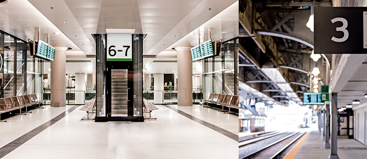 [4]
[4]Among the changes to the station are new staircases and train platforms, all of which needed to be clearly indicated to regular passengers.
After studying the issue, Entro determined its functional solution would be to use white text in a Clearview typeface on a dark grey background—providing a contrast level greater than 70 per cent—for all primary wayfinding and identity signage, with a minimum letter height of 75 mm (3 in.). A blue background would indicate wheelchair-accessible routes. Braille dots and tactile characters would be key elements on signs within reach. And moving beyond signs, the company would help develop an accessible website with trip pre-planning tools.
Heritage in design
Entro’s sign designs also had to be informed by Union Station’s heritage designation, as enforced by Parks Canada. This means any installation of new signs must be sensitive to the integrity of the building’s surfaces and finishes, with as few drill holes as possible, ensuring they can be removed at some point in the future without causing damage.
In addition to Parks Canada, the project required co-ordination with and buy-in from other stakeholders, including the municipal government, Metrolinx and GO, Via, the TTC and several nearby commercial and tourism attractions, including the Fairmont Royal York Hotel and, perhaps most notably, the Air Canada Centre (ACC), which is directly attached to the station and draws more traffic than any other single ‘tenant.’
With all of these factors in mind, Entro’s team decided to echo the motif of Union Station’s grand pillars in a series of rectangular sign ‘modules’ framed in decorative elements, which would be installed upright at key decision points throughout the facility. Elsewhere, overhead directional sign modules would be ceiling-mounted with as few attachments points as possible, in horizontal configurations. And outdoors, large letters would spell out ‘Union Station’ at both the east and west ends of the building.
Parks Canada approved Entro’s preliminary, fixed and technical drawings throughout the design process, which wrapped up in late 2012.
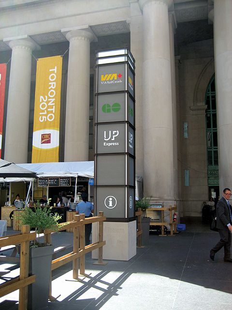 [5]
[5]Entro echoed the motif of the station’s pillars with sign modules installed upright at key decision points. Photo by Peter Saunders
From drawings to signs
Following the ultimate approvals, Entro’s drawings were put out for tendering by sign manufacturing companies. Five companies bid on the project and WSI Sign Systems in Bolton, Ont., was named the winner.
Since the tender, Entro’s work has mostly been a process of collaboration with the manufacturer. Prototypes were produced based on shop drawings, with WSI delivering a variety of sign packages to ensure the system met Union Station passengers’ needs. For example, the signs were tested on-site to ensure clear visibility.
“The concept is the same basic vision as we started with and hasn’t veered off much from the approvals,” says Aleks Bozovic, design director at Entro, “but along the way, there were many changes requested, which has meant a lot of juggling of final designs.”
(Also, as it happened, Entro’s hands-on approach to the project became a bit more convenient in 2013, when it moved from Parliament Street to new, larger offices on Harbour Square, just a short walk from Union Station.)
On to the next phase
The station’s York Street Concourse and Grand Hall, which represent approximately one-quarter of the overall revitalization project, opened to the public in early 2015 after nearly seven years of planning on Entro’s part.
In August, the next major phase began, with the station’s busy Bay Street Concourse closing after the Pan Am and Parapan Am Games for an anticipated two more years of renovations, during which time GO passengers will be rerouted through the York Concourse. Eventually, the Bay Concourse will reopen with nearly three times as much space for passengers to wait for their trains.
“We’ve passed our first major hurdle by installing signs in the York Concourse and major parts of the plaza,” says Bozovic. “We got them in before the Pan Am Games. They can now give the public an expectation of the rest of the program to come over the next two years.”
With files from Entro, the city of Toronto, GO Transit, Metrolinx and the TTC. For more information, visit www.entro.com[6], www.toronto.ca[7], www.gotransit.com[8], www.metrolinx.com[9] and www.ttc.ca[10].
- [Image]: http://www.signmedia.ca/wp-content/uploads/2015/11/101_DSC2142_med_res.jpg
- [Image]: http://www.signmedia.ca/wp-content/uploads/2015/11/DSC0872.jpg
- [Image]: http://www.signmedia.ca/wp-content/uploads/2015/11/DSC0871.jpg
- [Image]: http://www.signmedia.ca/wp-content/uploads/2015/11/edit1.jpg
- [Image]: http://www.signmedia.ca/wp-content/uploads/2015/11/IMG_8998.jpg
- www.entro.com: http://www.entro.com
- www.toronto.ca: http://www.toronto.ca
- www.gotransit.com: http://www.gotransit.com
- www.metrolinx.com: http://www.metrolinx.com
- www.ttc.ca: http://www.ttc.ca/
Source URL: https://www.signmedia.ca/wayfinding-systems-uniting-union-station/