
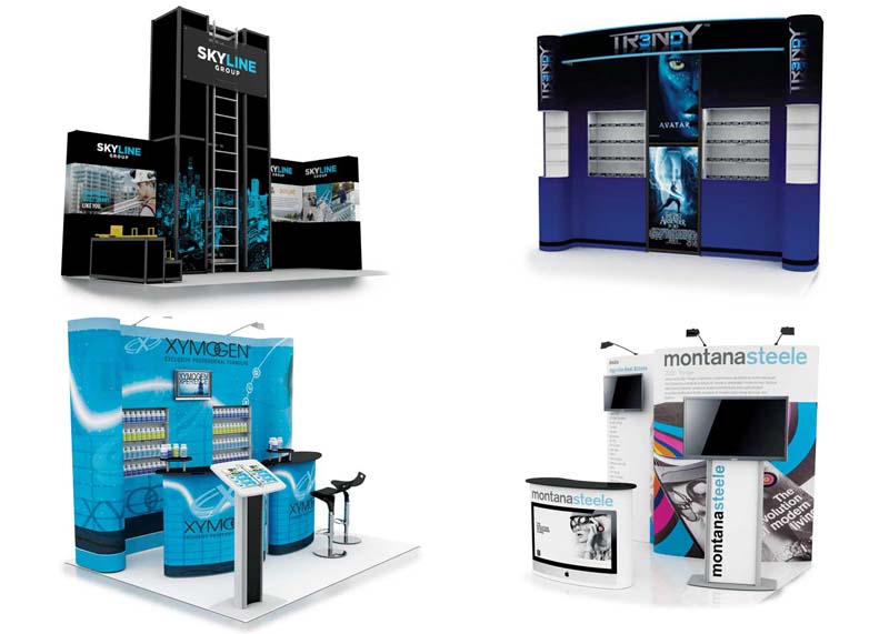
Graphic design software enables detailed renderings early in the process.
Enhancing visibility
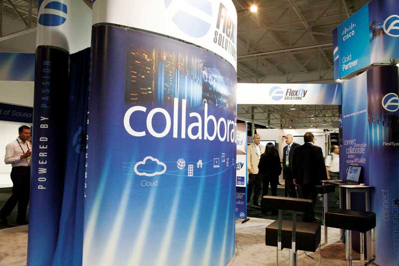
Of course, when designing signage for a specific trade show, the venue should also be taken into consideration. The client’s name and logo will both need to enjoy prominence on the trade show floor. For maximum visibility throughout the venue, the higher up they can be positioned on banners and backdrops, the better. Even beautiful graphics will have no impact if they are installed at waist level, where they will be obscured behind milling crowds.
Similarly, brand visibility is increased when all display components—including pedestals, tables and free-standing structures—are printed with graphics. The overall ‘sign system’ needs to be taken into consideration at the design stage.
Communicating quickly
As mentioned, in a trade show environment, a sign or display has a grand total of three seconds, on average, to connect with attendees. This is why the careful composition of logos, imagery and text is so important. There is very little time for people to evaluate a message before making the crucial decision to (a) stop and learn more about it or (b) take a pass and move on.
The designer’s goal, then, is to make the most of those three seconds by sparking a meaningful consideration of the brand with just a fleeting glimpse. This can only be achieved by using images and text sparingly—choosing graphics that clearly illustrate the message and text that concisely explains what the brand is about.
A one-sentence tagline is ideal. If any further information absolutely must be presented about the client’s products and services, then a short bullet list may be considered.
Many components of a trade show booth can be printed with graphics.
To ensure a design will be effective, it should be tested with colleagues by showing it to them for only three seconds, then asking them:
- What did you notice?
- What did you like most about the design?
- What did you not like about the design?
- What was its message?
Checking sightlines
Research is also paramount in the preliminary stages of design to ensure a sign or display will be effective. By way of example, this can entail seeking out images from past events and inserting a new design into them.
This is a good way to check if a new colour scheme stands out, if the images are clear and recognizable and if any sightlines to the logo and other key branding elements will be obstructed. Side-by-side comparisons are a great way to check the overall efficacy and intended performance of a display’s three-second test on the trade show floor well before the actual event.
Choosing colours
Colours are also important elements of design, as the way they are used will affect people’s perceptions of a brand. They are even powerful enough to affect someone’s mood and judgment.
Colour theory is a broad subject with formulas, principles and guidelines determined by an even broader spectrum of possible conditions, but the most important concept is the notion of a pleasant colour harmony, which is produced by combining complementary hues and introducing contrasting colours where juxtapositions are needed. This means keeping the basic colour palette limited to a range of complementary colours and adding contrasting ‘pops’ of other colours to draw attention and interest to specific parts of the design.
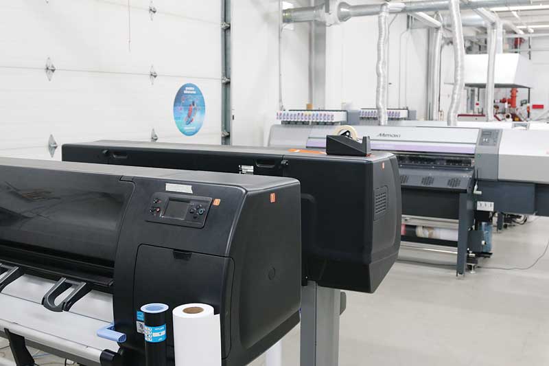
Digital printing presents a more straightforward and cost-effective alternative to traditional offset printing.
Colours are said to be in harmony simply when their esthetic produces a pleased response in the viewer. The nature of this positive response, however, will vary from person to person, as it is influenced by age, gender, cultural and social differences and other individual factors. So, it is important to know about the intended audience before making any colour-based design decisions.
The perception of colours has always been defined in the abstract, with no technical explanation formulated thus far as to how different types of inks and substrates affect the ‘colour experience’ for a viewer. That said, print service providers (PSPs) have long known about the challenges involved in reproducing a colour to a client’s exacting specifications. Whether recreating a skin tone at photographic quality or using special inks to conform to a client’s brand standard guidelines, colour matching is a vital process in today’s sign industry.
Offset or digital?
Traditional offset printing has solved the problem of colour matching with the addition of special inks to precisely match corporate logos and to add dramatic effects, such as metallic and neon hues, but these spot colours come at considerable extra cost to the client. The process is labour-intensive in comparison to digital printing, due to the necessity of creating printing plates and the drying time required before finishing, and a typical project may take an average of two weeks to complete.
Digital printing presents a more straightforward and cost-effective alternative process. The design files are submitted directly to the print production team, checked for accuracy and then sent along to the printer. Barring special considerations, such as seams for sewing fabric panels or other post-print production requirements, it is not unusual for the entire process to be completed in two or three days.
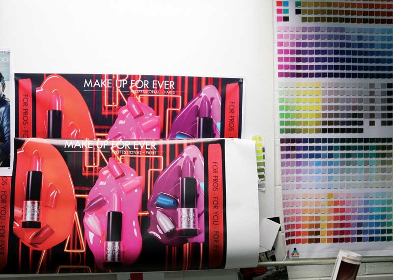
Colour matching requires physical printouts of final designs for proofing.
That said, the efficiency of digital printing is most pronounced for shorter runs. If a client requires 10,000 or more graphics with special inks and varnishes, on the other hand, then offset printing is the method of choice.
“The question of which is better depends on your needs,” says Serge Kaitaz, graphic production manager for Accenta, which designs, prints and fabricates trade show displays and booths, pop-up displays and counters in Mississauga, Ont. “With the availability of special inks, more choices for substrates and finishes—including gloss, matte and coated—and the ability to print white over any colour of substrate, offset printing creates a more precise product and allows for truer colours. And the inks sink into the paper, so cleaner finishes and better consistency can be achieved. For large runs, offset is the best choice. For smaller print runs, limited budgets and tight timelines, however, digital printing has been a truly great innovation. The options may be more limited, but for most signs and displays, digital saves both time and money.”


