Wide-format Graphics: Designing trade show displays
by all | 1 November 2016 10:15 am
Images courtesy Accenta
By Sherone Black
As the trade show season winds down for winter, there is no better time to take a step back and consider the materials displayed at these events. Signage, banners and booth graphics are often the first point of contact for new customers searching for products and services. As such, it is important for sign shop clients to ensure they are conveying the message they intend to. This is a question not only of wide-format printing and substrates, but also—and fundamentally—of graphic design.
To those unfamiliar with the field, a sojourn into the graphic design side of display marketing can be confusing at best and frustrating at worst. And terms like ‘choke,’ ‘crash,’ ‘creep,’ ‘burn,’ ‘widow,’ ‘bleed’ and ‘dagger’ can certainly make it seem like a negative place!
Nevertheless, it is important for business owners, marketing planners and exhibitors to gain a basic understanding of graphic design so they can boost their brand presence on the sales floor at trade shows and other special events. The careful composition of logos, imagery and text can ‘tell a story’ at a glance, which is vital in an environment where attendees only see such messages for an average total of three seconds.
Fortunately, they do not necessarily have to get it right the first time. Exhibitors, particularly the most budget-conscious among them, often choose to invest in sturdy, long-lasting banner display stands that are designed for ease of use via the swapping out of quick-change graphic panels. For them, the convenience of updating the displays’ messages far outweighs the initial costs of the units.
Whichever path they decide to take, however, there are some tried and true design approaches that never go out of style.
The venue needs to be taken into consideration to help optimize a display’s visibility.
Optimizing real estate
Graphic design is a continually evolving art form, where what is trendy today will seem outdated and/or overused a year from now, but good design always starts with ‘real estate’—that is to say, the blank canvas on which artwork will be printed to create a banner, sign or backdrop.
As this is where the brand image will ‘live’ for passersby, it is important to use the space wisely. First and foremost, it is important to give content room to breathe. Overcrowding a display will only create confusion, muddy the client’s message and alienate the potential customers with whom he/she is trying to connect.
Indeed, the phrase ‘less is more’ is nowhere more accurate than in the context of graphic design. Impactful design has a visual ‘rhythm’ and a natural flow that help make a message a pleasure for people to read. The urge to cover every square inch of space with images and text should be resisted. Customers will be grateful for a cooler, clearer design.
Measuring effectiveness
The phrase ‘user experience’ (UX) has become common in the world of online design to describe how people interact with a website, app or other property, but the concepts behind UX trace back to the industrial revolution and are relevant across multiple disciplines, including the design of trade show banners and signage.
The traditional metrics deployed to describe a system’s usability include efficiency, effectiveness and basic subjective satisfaction. As these terms suggest, a design should entice audiences with a pleasing, economical layout of words and impactful imagery, while increasing brand awareness and the potential for a return on investment (ROI).
 [1]
[1]Graphic design software enables detailed renderings early in the process.
Enhancing visibility
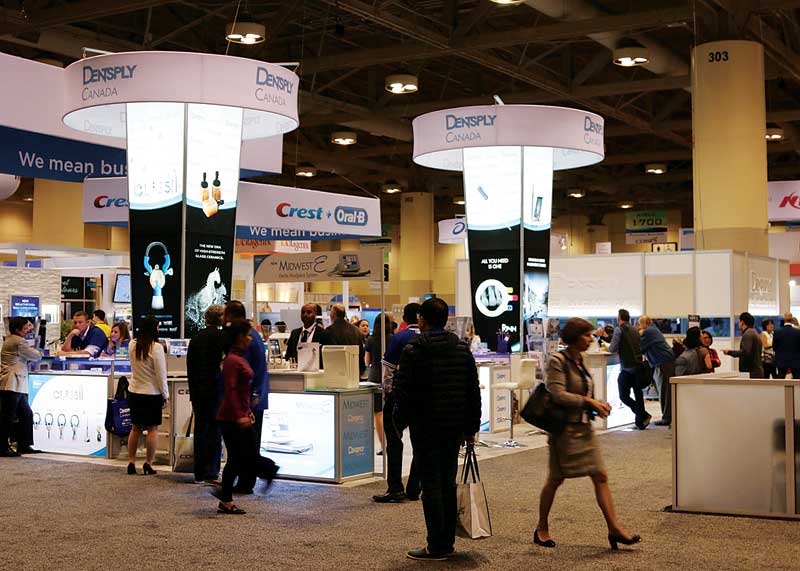
Of course, when designing signage for a specific trade show, the venue should also be taken into consideration. The client’s name and logo will both need to enjoy prominence on the trade show floor. For maximum visibility throughout the venue, the higher up they can be positioned on banners and backdrops, the better. Even beautiful graphics will have no impact if they are installed at waist level, where they will be obscured behind milling crowds.
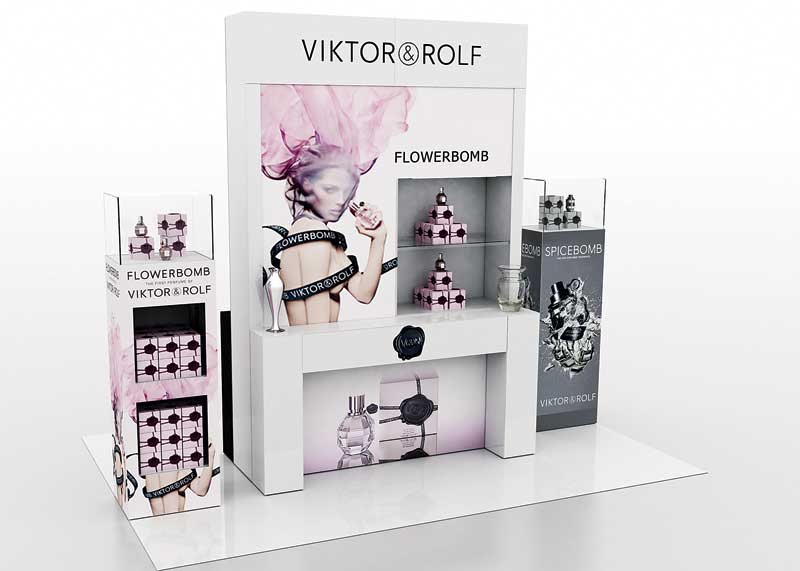
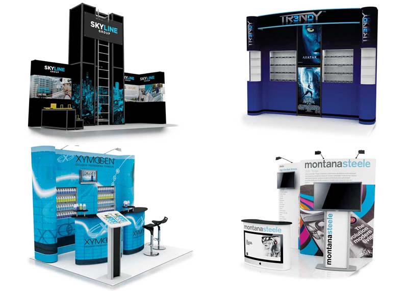
Similarly, brand visibility is increased when all display components—including pedestals, tables and free-standing structures—are printed with graphics. The overall ‘sign system’ needs to be taken into consideration at the design stage.
Communicating quickly
As mentioned, in a trade show environment, a sign or display has a grand total of three seconds, on average, to connect with attendees. This is why the careful composition of logos, imagery and text is so important. There is very little time for people to evaluate a message before making the crucial decision to (a) stop and learn more about it or (b) take a pass and move on.
The designer’s goal, then, is to make the most of those three seconds by sparking a meaningful consideration of the brand with just a fleeting glimpse. This can only be achieved by using images and text sparingly—choosing graphics that clearly illustrate the message and text that concisely explains what the brand is about.
A one-sentence tagline is ideal. If any further information absolutely must be presented about the client’s products and services, then a short bullet list may be considered.
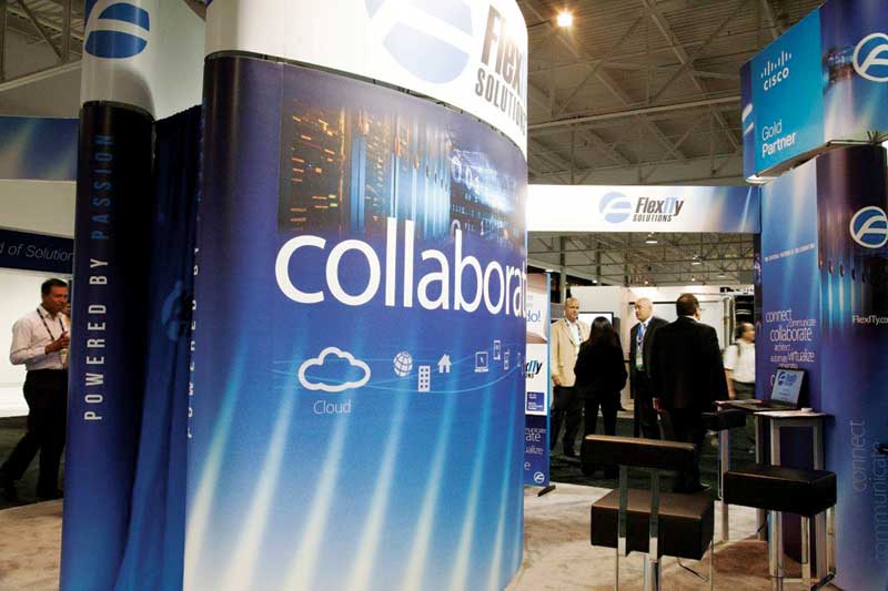
Many components of a trade show booth can be printed with graphics.
To ensure a design will be effective, it should be tested with colleagues by showing it to them for only three seconds, then asking them:
- What did you notice?
- What did you like most about the design?
- What did you not like about the design?
- What was its message?
Checking sightlines
Research is also paramount in the preliminary stages of design to ensure a sign or display will be effective. By way of example, this can entail seeking out images from past events and inserting a new design into them.
This is a good way to check if a new colour scheme stands out, if the images are clear and recognizable and if any sightlines to the logo and other key branding elements will be obstructed. Side-by-side comparisons are a great way to check the overall efficacy and intended performance of a display’s three-second test on the trade show floor well before the actual event.
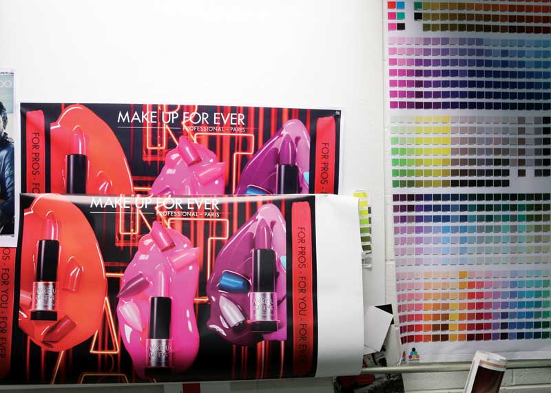
Choosing colours
Colours are also important elements of design, as the way they are used will affect people’s perceptions of a brand. They are even powerful enough to affect someone’s mood and judgment.
Colour theory is a broad subject with formulas, principles and guidelines determined by an even broader spectrum of possible conditions, but the most important concept is the notion of a pleasant colour harmony, which is produced by combining complementary hues and introducing contrasting colours where juxtapositions are needed. This means keeping the basic colour palette limited to a range of complementary colours and adding contrasting ‘pops’ of other colours to draw attention and interest to specific parts of the design.
Digital printing presents a more straightforward and cost-effective alternative to traditional offset printing.
Colours are said to be in harmony simply when their esthetic produces a pleased response in the viewer. The nature of this positive response, however, will vary from person to person, as it is influenced by age, gender, cultural and social differences and other individual factors. So, it is important to know about the intended audience before making any colour-based design decisions.
The perception of colours has always been defined in the abstract, with no technical explanation formulated thus far as to how different types of inks and substrates affect the ‘colour experience’ for a viewer. That said, print service providers (PSPs) have long known about the challenges involved in reproducing a colour to a client’s exacting specifications. Whether recreating a skin tone at photographic quality or using special inks to conform to a client’s brand standard guidelines, colour matching is a vital process in today’s sign industry.
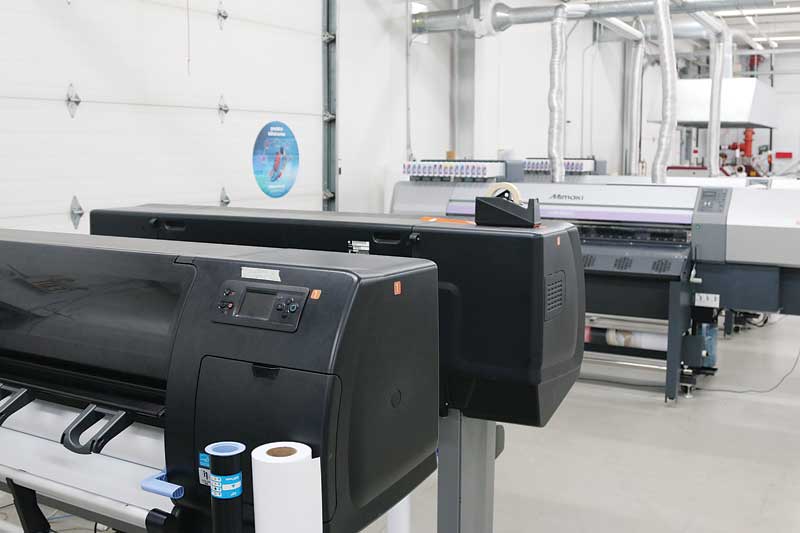
Offset or digital?
Traditional offset printing has solved the problem of colour matching with the addition of special inks to precisely match corporate logos and to add dramatic effects, such as metallic and neon hues, but these spot colours come at considerable extra cost to the client. The process is labour-intensive in comparison to digital printing, due to the necessity of creating printing plates and the drying time required before finishing, and a typical project may take an average of two weeks to complete.
Digital printing presents a more straightforward and cost-effective alternative process. The design files are submitted directly to the print production team, checked for accuracy and then sent along to the printer. Barring special considerations, such as seams for sewing fabric panels or other post-print production requirements, it is not unusual for the entire process to be completed in two or three days.
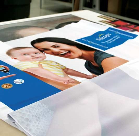
Colour matching requires physical printouts of final designs for proofing.
That said, the efficiency of digital printing is most pronounced for shorter runs. If a client requires 10,000 or more graphics with special inks and varnishes, on the other hand, then offset printing is the method of choice.
“The question of which is better depends on your needs,” says Serge Kaitaz, graphic production manager for Accenta, which designs, prints and fabricates trade show displays and booths, pop-up displays and counters in Mississauga, Ont. “With the availability of special inks, more choices for substrates and finishes—including gloss, matte and coated—and the ability to print white over any colour of substrate, offset printing creates a more precise product and allows for truer colours. And the inks sink into the paper, so cleaner finishes and better consistency can be achieved. For large runs, offset is the best choice. For smaller print runs, limited budgets and tight timelines, however, digital printing has been a truly great innovation. The options may be more limited, but for most signs and displays, digital saves both time and money.”
Preparing templates
Graphic templates are very useful tools because they provide a precise replica of the graphic space available on a real-world product and indicate where any folds, curves, seams and panel edges are located. This makes it easier for both the client and the production team to determine precise image and text placement.
With this in mind, many sign and graphic shops make graphic templates available for download through their websites for their clients, with each corresponding to a different display size and format. For clients who request custom displays, meanwhile, in-house designers prepare a custom template with the specific job’s needs in mind.
It is also helpful if shops can accept clients’ artwork files prepared with a wide variety of standard design software packages, from Adobe Illustrate to CorelDraw to QuarkXPress.
Inks will sink into the fibres of fabric panels.
Printing colours
A computer screen displays images in red, green and blue (RGB), which is an ‘additive’ colour space. Setting each of RGB to equal values of 100 per cent will yield white, while the complete absence of colour—i.e. black—is achieved by setting the same values to zero per cent.
Process printing, on the other hand, uses the ‘subtractive’ colour space of cyan, magenta, yellow and key/black (CMYK). In this case, setting each value to 100 per cent will yield black and reducing them to zero per cent will yield white.
This is important to understand when displaying colours in the real world. As light hits a printed substrate, it is reflected back at the viewer, who perceives the colour of the paper mixed with the colour of the illumination. Adding cyan ink to the paper, for example, will absorb or subtract other wavelengths of light, resulting in the viewer perceiving the colour of cyan. This is why the same printed graphic will look different from one substrate to another, even when the same CMYK values have been specified.
“Best practices for colour matching suggest using a physical printout of the final design to proof against,” says Kaitaz. “Keep in mind, due to variations in substrate type and colour and light source interpretation, it will not always be possible to match all colours exactly in CMYK. Ink is delivered in droplets that react to different substrates in different ways. A job may therefore also require the use of special spot colours.”
Achieving smooth images
The resolution quality of a graphic can also be affected by the nature of the substrate onto which it is printed.
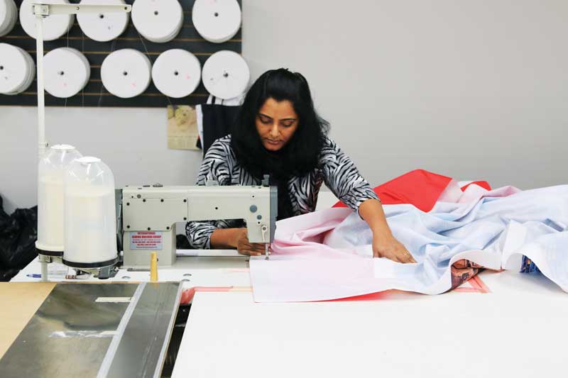
Special finishing considerations for fabric panels include seams for sewing.
“With fabric graphic panels, the ink sinks into the fibres,” Kaitaz explains. “Image edges are softer and the tendency toward ‘pixelation’ at lower image resolutions is slightly reduced, due to the more forgiving nature of the fabric. Graphics printed on paper, on the other hand, will be sharply defined with crisper edges. By way of comparison, a 1 x 1-m (40 x 40-in.) image printed on fabric will have a minimum image resolution of 100 dots-per-inch (dpi), compared to paper, where the minimum recommended resolution for the same printed image at the same size will need to be at least 150 dpi to avoid the appearance of jagged edges.”
Hence the need for vector-based graphics where possible, to ensure images can be reproduced perfectly on everything from a 3-m (10-ft) wide fabric backdrop to a 3 x 6-m (10 x 20-ft) rigid display board. As vector graphics are digital images created by using mathematical points, rather than pixels, they can be scaled up from business card to billboard without any loss of quality or detail whatsoever.
Logos, for example, should always be provided in a vector-based format. So too should product names and descriptions be converted to outlines before the design files are submitted for printing.
Whether through colour matching or image adjustments, there is much sign shops can do for their clients to ensure their finished banner stands, exhibits, signs and other trade show displays meet or exceed their expectations.
Sherone Black is a freelance writer and graphic designer for Accenta, which designs and fabricates trade show displays and booths, pop-up displays and counters in Mississauga, Ont. For more information, visit www.accenta.com[2].
- [Image]: http://www.signmedia.ca/wp-content/uploads/2016/10/edit1-2.jpg
- www.accenta.com: http://www.accenta.com
Source URL: https://www.signmedia.ca/wide-format-graphics-designing-trade-show-displays/