Wide-format Printing: Common colour management mistakes
by all | 8 December 2015 10:42 am
 [1]
[1]Photos © BigStock.com
By Mike Ruff
Executing a properly organized colour management workflow can be challenging for sign and wide-format print shops running multiple digital devices and using various ink platforms. As advanced as raster image processors (RIPs) and other software have become, it is essential to achieve process control, not just speed. And while the G7 method for colour process imaging (see Sign Media Canada, April 2015, page 70), published by the International Digital Enterprise Alliance (IDEAlliance), can certainly provide a significant production advantage, it is no silver bullet.
The following are the most common mistakes shops are making with their colour management workflow, based on discussions with dozens of prepress professionals, along with some industry standards and ‘best practices’ to help them get their printing under better control.
1. Trying to correct colour at the press.
In many cases, printing companies tweak colours multiple times to achieve their clients’ given specifications. This approach should not be considered acceptable in a high-volume, profitable production environment. Rather, proper and accurate colour management needs to occur well before a graphic goes to the printer, so as to prevent the need for colour correction.
Unfortunately, it is common for shops to rely on a single media configuration or ‘profile’ for all of their printing. This leads to press operators essentially ‘experimenting’ with colour for every job, rather than knowing what the result will be before the printing process. To maintain this predictability, it is important to evaluate printed results and fine-tune media configurations on
a regular basis.
 [2]
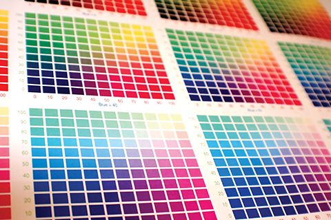
[2]Colour charts can help track variations.
2. Failing to normalize incoming files to be colour-managed.
A recent survey by Xerox found only 20 per cent of digital printing companies preflight their files—leaving the other 80 per cent facing unpredictable print results—and even for those that do, 50 per cent of their incoming files fail. So, they end up complaining about the variability of incoming files.
The obvious solution to this problem is to fix the failed files. This process is referred to as ‘normalization.’
Some print professionals today ‘manually’ preflight and normalize their files with software like Adobe’s Acrobat Pro, but this is slow and can become burdensome as the volume of files increases. Other shops use ‘semi-automated’ software that identifies problems, but can’t always fix them.
Better to use fully automated preflighting software to both find and fix most problems, while flagging the others that cannot be automatically fixed—e.g. missing images—for human intervention. RIPs and other software continue to become more fully automated, but cannot overcome all problems with bad files coming to the press, so it is important
to only send normalized files to the printer.
3. Altering the underlying characteristics of a device after profiling it.
One common infringement in this regard is applying a correction curve to a profiled device in the hope of improving colour output. This is certainly not the G7 method.
G7 correction curves are applied to the base linearization to grey-balance a device prior to profiling. Alternatively, some RIPs now allow a G7 grey balance adjustment to the linearization after the profiling is complete, which is great for managing a profile and helps avoid reprofiling.
Good profiles do not go bad; they are simply invalidated by changes to underlying system conditions. If a printer operator curves an existing profile, rather than grey-balancing the linearization, he/she is changing all of the colours that have already been matched through the colour management process.
The key is to grey-balance the linearization—not the profile—with G7 correction curves.
4. Viewing colours under poor ambient conditions.
The final approval of a qualified profile is often based on visual assessment, but this will only work if the viewing conditions do not add any colour cast to the image.
To avoid colour cast, it is important to comply with the International Organization for Standardization’s (ISO’s) 3664:2009, Graphic Technology and Photography—Viewing Conditions. Reviewed in 2015, this standard publishes requirements for five conditions:
- Colour quality (including chromaticity, colour temperature and spectral power distribution).
- Light intensity of 2,000 lux for prints and proofs, with tolerance of plus or minus 500 lux.
- Evenness within 60 per cent of 2,000 lux (i.e. 1,200 lux) across the entire viewing surface.
- Neutral and matte ‘surround,’ with luminance reflectance between 10 and 60 per cent.
- Geometry of the light source, image and observer’s eyes, positioned to minimize specular reflectance (i.e. glare).
Another problem can occur with the substrate. Many paper manufacturers today use optical brightening agents (OBAs), but these can actually make white paper appear blue and thus have a negative effect on viewing conditions by causing metamerism (i.e. the ‘apparent’ matching of colours without matching their spectral power distributions). Even this level of colour cast will be unacceptable to clients who require repeatability of their branding.
Colour itself is an effect of light, so colour control relies on well-controlled lighting conditions. Lighting indicator tests are available to assist in achieving such control.
5. Non-calibrated or poorly calibrated monitors.
When addressing ‘soft proofing,’ ISO Draft International Standard (ISO/DIS) 12646:2014, Graphic Technology—Displays for Colour Proofing—Characteristics, explains how to properly calibrate monitors for colour management workflows. Soft proofing really relies on a system comprising the monitor, software, computer configuration and control over the viewing area.
IDEAlliance, for its part, has certified monitor systems in three categories. Full details are available at its website (www.idealliance.org[3]).
 [4]
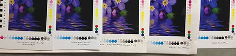
[4]When the same file is printed on different substrates, colour control problems can show up clearly. Using the right colour configuration from the beginning will prevent the need to shut down the production line and attempt to correct colour on the press. Photo courtesy Mike Ruff
6. Assuming a profile is good forever.
As mentioned, good profiles do not go bad. Nevertheless, process conditions will certainly change over time for a variety of reasons, whether naturally, by accident or on purpose (e.g. when device operators make changes).
A profile is simply a snapshot of a printing environment at a moment in time. When that environment’s underlying conditions change for any reason, then either the system needs to be brought back to its original conditions through relinearization or the device needs to be reprofiled.
7. Not understanding how to calibrate and verify the print target.
With today’s mix of soft and hard proofs, it is easy for a print shop professional to neglect checking whether or not the client’s hard-copy proof submitted with the electronic graphic file is indeed accurate. It may be possible to (a) trust a colour bar or (b) compare the file to the proof, but the best solution is instead to create a new proof from the file internally—with a system known to be accurate—and compare it to what the client submitted.
For such purposes of matching a common offset proof, the relevant industry standard is ISO 12647-7:2013, Graphic Technology—Process Control for the Production of Half-tone Colour Separations, Proof and Production Prints, or American National Standards Institute (ANSI) Committee for Graphic Arts Technologies Standards (CGATS) Characterization Reference Print Condition (CRPC) 7, Typical Extra-large Gamut Printing Processes.
8. Using the wrong configuration.
A configuration is not just a profile; it also encompasses the RIP, the printing resolution, the inks, the substrate and the printer settings. So, if anything changes after a device profile has been set up, then it will produce inaccurate results.
This is why it is important to check the results after any changes to the configuration, to see if those results are still within acceptable tolerances.
9. Not using the correct rendering intent.
The rendering intent is applied in the device profile based on the user’s purposes, so it can vary. Options include colorimetric, relative, saturation and perceptual rendering intents. A relative rendering intent, for example, corrects colour based on the paper being printed.
10. The wrong choice of source profile.
A source profile may be referred to as a CRPC, an input target or just a target profile. If the printer supports a wide colour gamut but the source profile selected is narrow, then colour will be lost along the way. So, it is important to pay attention to the source profile with reference to the expected final results based on the substrate and the gamut of the printing device.
 [5]
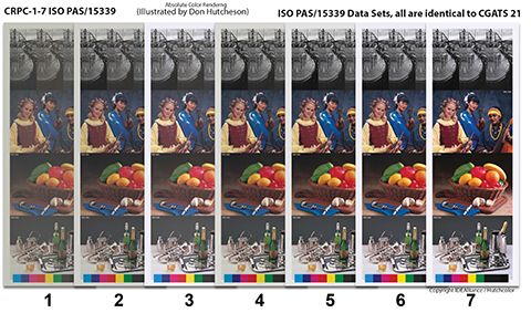
[5]One standard that has been a major success for grand-format printing is ANSI CGATS 21:2013, which covers the unique limitations of different processes and spans a range of colour gamuts for the production of printed materials. Image courtesy Mike Ruff
One standard that has been a major success for the grand-format printing industry, where substrates are rarely as straightforward as white paper, is ANSI CGATS 21:2013, Graphic Technology—Printing from Digital Data Across Multiple Technologies, including Part 1: Principles and Part 2: Reference Characterization Data. Assuming data preparation can be largely process-independent, this standard (a) covers the unique limitations of different processes and (b) specifies seven CRPCs that span a range of colour gamuts used for the production of printed material from digital data, regardless of the particular process.
This way, colour management can allow the choice of printing process to be based on the run length and type of substrate and still achieve the desired appearance in the final graphic product.
11. Not addressing process control from the start.
Any system to be colour-managed must be repeatable and kept at a consistent, normalized state, which needs to be documented. There is no possibility of colour-managing a system that is out of control.
Changes may be mechanical or caused by day-to-day temperature and humidity fluctuations. A standard colour bar will help track variations, determine whether or not they are within accepted tolerances and, if they are not, expose the causes so they can be fixed.
“If a system isn’t in control and verified as such, then it is in an uncontrolled environment and colour management will happen poorly at best,” says Herb Jones, an art director and prepress manager certified by IDEAlliance in G7.
12. Poor training.
Expensive equipment often comes with free training, but given the installer’s time on-site is limited by budget, the process involves little more than, “Watch this!”
Print professionals should not cut corners on colour management training. It is worthwhile to invest in quality trainers—not just the technician who installs the machine—and give them enough time to work with the given staff. The investment will quickly pay off in uptime.
Mike Ruff is a certified G7 process control and conformance (PCC) expert, certified G7 expert instructor, chair of the Academy of Screen and Digital Print Technology (ASDPT) and owner of Mike Ruff Consulting Services. For more information, contact him via e-mail at mruff@mikeruffconsulting.com[6].
- [Image]: http://www.signmedia.ca/wp-content/uploads/2015/12/bigstock-large-format-ink-jet-printer-83316869.jpg
- [Image]: http://www.signmedia.ca/wp-content/uploads/2015/12/bigstock-Color-Chart-1614968.jpg
- www.idealliance.org: http://www.idealliance.org
- [Image]: http://www.signmedia.ca/wp-content/uploads/2015/12/Substrate-Challenges.jpg
- [Image]: http://www.signmedia.ca/wp-content/uploads/2015/12/15339-In-Pictures.jpg
- mruff@mikeruffconsulting.com: mailto:mruff@mikeruffconsulting.com
Source URL: https://www.signmedia.ca/wide-format-printing-common-colour-management-mistakes/