
Wide-format Printing: Making colour universal
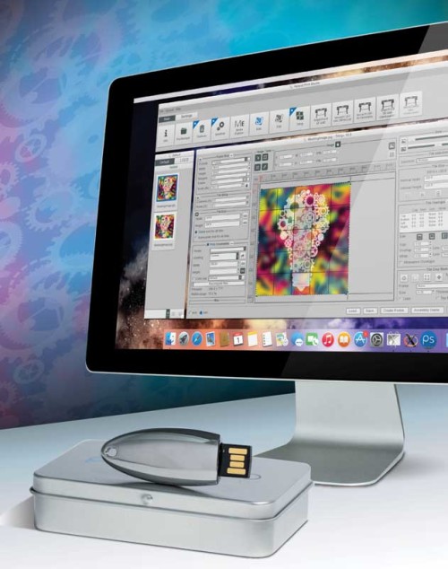
Photo courtesy Roland DGA
Determining feasibility
Many graphic designers want to use colours that are new and unique, but they also need to know whether or not their ideas are practical for real-world applications. What they see, after all, may not be what they get.
Today, they should be able to judge colour in their own software. New technologies allow them to create and visualize colours on a properly calibrated monitor and determine if they can be reproduced in printed form, rather than wait until prints are produced, when it is too late to evaluate the outcome. The need to rework designs can be prevented by avoiding impractical concepts in the first place.
Communications between the designer and the brand owner are especially important at this stage. Further, with the right software supporting proofing at remote sites, a variety of partners in the supply chain can review colours immediately, from the comfort of their own offices.
Another new and popular feature is three-dimensional (3-D) product visualization. The processes of design and colour communications can both benefit tremendously from visualizing printed graphics in 3-D. It becomes possible, for example, to predict effects like the pearlescence of special inks or the impact of different lighting conditions. And by allowing designers to request physical samples of only the best virtual files, the process is accelerated. In fact, visualizing 3-D objects has been shown to eliminate 60 to 80 per cent of non-desired colours during early proofing.
The next step will be for such software to more accurately represent how the specific substrates and pigments will appear. The technology is getting there, bit by bit.
Defining colours for production
The process of colour specification—i.e. translating a design concept for real-world production—has often been subjective and/or insufficiently detailed. Most colours today are still specified using catalogues, not electronically, and without considering the specific materials that will be printed. The outcome, often, is inconsistency.
This is another reason it is important for creative and pre-press designers, brand owners and PSPs alike to use colour matching software to define standards for their products. An entire colour program can be defined across a variety of technologies, applications and substrates, from standard specification to development, compliance and, ultimately, supplier review.
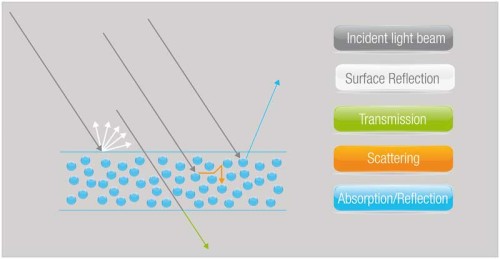
Image courtesy Match My Color
Once colours are defined, the next step is to formulate colour ‘recipes’ for different materials, so as to ensure designs are effective in a print production environment. Here, too, advanced software will help reproduce specified colours to stringent requirements, whether the inks will be opaque or translucent. Even users with limited technical expertise can ensure colour consistency.
Also, once a recipe is created, it must be dispensed correctly. Software can control this process of communicating with print hardware.
Quality control
Making sure printed graphics conform to standards with defined colour tolerances is essential for PSPs. Quality control software can measure, monitor and control both spot and process colours, even under different illumination conditions.
With relatively simple communications protocols, brand owners can track the performance of their colour standards (a) over time and (b) in different locations. Colour management software can create charts that show them, at a glance, when, where and how any deviations are affecting their chosen colours.
For international brands, it has proven immensely challenging in the past to ensure printers, inks and substrates around the world can all produce the same, agreed-upon colours. To accomplish this requires connectivity via large-scale business systems, such as library information management systems (LIMSs) and enterprise resource planning (ERP) systems, which allow various departments to access all data about materials being printed and the quality of the final results. Ultimately, this approach also yields greater flexibility in global sourcing.
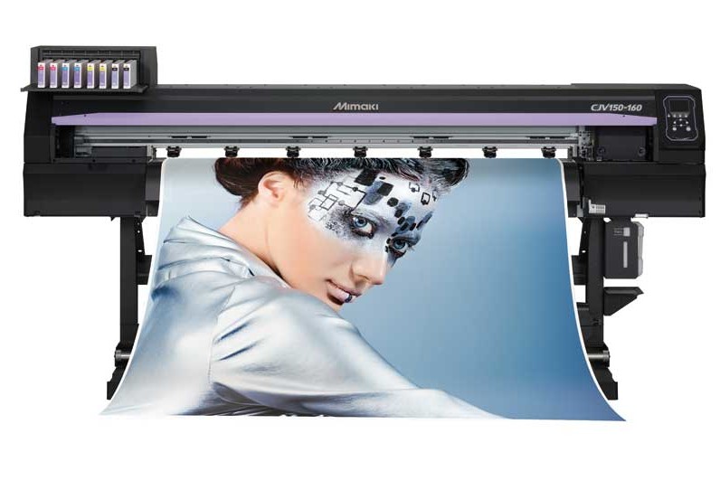
Image courtesy Mimaki
Further flexibility is provided by software that is suitable not only for the graphic arts industry, but also for other applications like packaging, cosmetics, plastics, fibres and ceramics. Complex colour recipes using more than 10 colourants, for example, have been developed specifically for the automotive refinishing market. These have helped support the rise of tuning films, which replicate solid, opaque, translucent, metallic and multi-colour effects that previously would have been painted.
Putting the puzzle together
Graphic designers should have the freedom to select colours for brand marketing purposes, but they should also have the means to validate these colours for print production. A good communications platform will connect everyone in the supply chain to ensure colours remain accurate no matter what substrate is printed.
Further, brand owners should be able to partner with PSPs around the world through the open communication of colour standards. This is now possible with today’s design, colour management and business software and measuring, dispensing and production systems.
There are many pieces to this puzzle, but with today’s tools, they can all be brought together to make colour ‘universal’ with a single system.
Judy van de Langkruis is a managing partner in Match My Color, a colour management software developer. For more information, visit www.matchmycolor.com or contact her via e-mail at judy.vandelangkruis@matchmycolor.com.
Sign up for our newsletter
Featuring breaking news from Canada's sign and graphics industry.
Products


Read the Latest Issue

