
Spot colours
Undefined spot colours are printed using an alternate space, usually CMYK. If the designer has taken this into account, then the results might look very different, due to the same reasons cited above for colour differences.
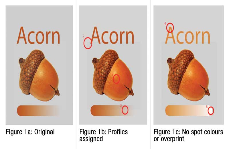
By way of example, Figure 1a (right) shows the output of a document created using Adobe Illustrator graphic design software, comprising an RGB image of an acorn, an embedded standard RGB (sRGB) colour space profile, a grey background sampled from the image, text with colour sampled from the image and another gradient derived from the same colour.
Figure 1b shows what happens when the designer’s intent is ignored—likely unintentionally and relying on default application settings. A colour difference appears, for example, because the background is defined in CMYK without a profile. Adobe Illustrator would have defined the CMYK from the grey of the sRGB space and converted it to the Specifications for Web Offset Publications (SWOP) profile, i.e. the designer’s working space. If the combination of profiles and rendering intents assigned to the image and the background is not exact, then such a colour difference will appear.
Further, the acorn became brighter and more saturated compared to the rest of the design. This is because it was mapped directly to the printer gamut. This is a desirable result, but breaks the match between the text and the gradient colours in the design. The gradient is defined by an overprinting spot colour. The background now has two different appearances, also seen in the overprinting and blending effects.
Finally, Figure 1c shows what happens when the spot colours are replaced as RGB or CMYK before being RIP’d or when the overprint is turned off to counter the gradient effect in Figure 1b. The text no longer overprints, as its colour has been replaced with a CMYK version that represents the spot colour. The CMYK match is very accurate, but due to the overprinting effect, the spot colour is darkened by the grey background.
The gradient no longer shows the correct overprinting effect. The original spot colour was a duotone, fading to zero of another spot colour. As a result, it has nicely blended away. Now, however, due to either turning off the overprint or replacing the spot colours with their CMYK equivalents, the overprinting blend is lost and blends to white. Any change made to the original design by assigning or removing embedded profiles, disabling overprints or replacing spot colours before RIP-based blending will result in ‘broken’ output.
With all of this in mind, one may well wonder, why use colour management at all? The alternative of not using it, however, means sending a design file’s CMYK data directly to the printer via linearization, which results in the least colour consistency, so it is definitely not recommended. Rather, the better approach is to use standardized printing.


