
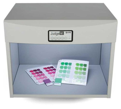
Printed graphics should be checked under the same lighting conditions they may actually encounter once they are installed in the field.
Characterization
While calibration is the process of adjusting the printing device’s behaviour to meet certain targets, characterization—also known as profiling—is the process of modifying how the device prints various colours, based on the inks and substrates being used. Typically, the results
of characterization are stored as an International Color Consortium (ICC) device profile, which then allows a colour management system or colour-aware application to make necessary modifications as the need arises.
“The first steps in characterization are to print a set of ‘profile patches’ and then create a profile that takes into consideration that device, the ink set and the target substrates,” says Spevak. “That is used for linearization of the RIP. If you do those things with a properly calibrated digital printer, you are golden. You will get the best colour for the gamut that is possible for that ink and that media.”
Linearization refers to the process of optimizing the printer’s imaging system as a means of controlling all of the optical and physical variables involved in printing the image to generate an image with predictable and consistent results.
Conversion
The fourth consideration, conversion, involves the transformation of one type of colour space to another.
“This is the least-understood of the four Cs,” says Lou Prestia, a senior product line manager for EFI. “When we calibrate or characterize, we are creating one-, two- or three-dimensional (1-, 2- or 3-D) tables. The conversion stage is when we apply those different tables to accomplish a transformation.”
In this sense, conversion is highly reliant on the steps that precede it.
“If you are making a profile and converting the colours in software like Adobe Photoshop, it is as easy as clicking ‘convert to profile’ and choosing the rendering intent and the destination profile,” says Prestia, “but in the world of digital printing, it is a more complicated process because there is discrete calibration, a 2-D lookup table on most RIPs and a characterization or ICC profile, which is typically 3-D, depending on how many inks are being used. This is why it is very important to use the appropriate calibration, the 2-D density or tonality correction in the creation of the profiling patches and the right profile for the printer. Only by using them together—and not ignoring the conversion phase of the overall process—will colour management deliver the precision, consistency and expected results you are aiming for.”
Other considerations
During colour management, another critically important aspect is the set of lighting conditions under which colours are being evaluated. The same colour will look very different, after all, under different lighting conditions. The International Organization for Standardization’s (ISO’s) 3664:2009, Graphic Technology and Photography—Viewing Conditions, was reviewed in 2015 and specifies how viewing areas should be illuminated, whether using light booths or building lighting.
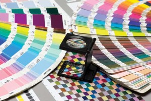
The Pantone Matching System (PMS) helped standardize ink colours.
Photo © Bigstock.com
“ISO 3664:2009 is a great standard for people in production,” says Juergen Roesch, manager of business development for colour management software developer GMG Americas, “but it is also important to understand your controlled viewing conditions in your production department may not be consistent with the printed graphics’ actual end-use viewing environment, which can cause some level of discontinuity.”
With this in mind, light booths are now available that enable viewing under a wide variety of possible lighting conditions, so printed materials can be checked under the same conditions they may actually encounter once they are installed in the field.
Another consideration is continuing education. While colour management is, in many ways, becoming easier for the sign and graphics industry, there is still much education needed, both in production environments and on the customer side.
“One of the most important considerations for the sign industry today is colour education,” says Leslie Herrmann, workflow studio manager for Global Imaging, which integrates wide- and grand-format printing systems with supplies. “This involves ensuring you are up-to-date on colour standards and how to implement colour management. Without that knowledge, you are basically crawling around in the dark.”
There are many resources available to help signmakers learn more, including online training, professional consulting and certification processes. Even colour experts find it important to stay current and learn about the latest developments. Investing in the development of colour management expertise is certainly one of the most important steps any sign and display graphics business can take, as it will move that organization to a whole new level of professional expertise.
Alfonso A. Hernandez, Jr., is a regional sales manager for X-Rite Pantone, which develops colour management systems. The International Digital Enterprise Alliance (IDEAlliance) has certified him as a G7 expert and as a process control expert and has master-certified him as a colour management professional (CMP). This article is based on information he presented in December 2015 at the United State Sign Council’s (USSC’s) annual Sign World International show. For more information, visit www.xrite.com.


