
Wide-format Printing: Understanding colour management
By Jim Raffel
When professionals in the wide-format printing sector hear the term ‘colour management,’ many immediately think of the process of creating custom International Color Consortium (ICC) profiles. The entire colour management process involves much more than that, however, including many variables that need to be understood and controlled.
For most shops in the industry, the goals of colour management include matching colours between devices, achieving accurate spot colours, repeating the same job over time and establishing a sufficiently wide gamut to produce enough colours to satisfy customers’ requirements. These goals, which all relate to colour consistency, can be reached through the following three-step process:
1. Printer calibration.
2. Colour verification.
3. Process control.
With this process, it becomes easier to create customized ICC profiles that will continue to work well over time—but the ease of the process does not mean it is a simple one, as there are many concepts that need to be understood, proficiently managed and mastered.
ICC profiles
An ICC profile is like a digital ‘map,’ laying out how a given wide-format inkjet printer should place a combination of inks on a given substrate to produce colours to certain specifications. This is important because not all printers produce colour exactly the same way; those from different manufacturers use different ink and printhead technologies. And the variety of raster image processors (RIPs) and substrates available today can add to the complexity of achieving consistent, repeatable colours.
In many cases, ICC profiles are available from printer and substrate manufacturers, ready for loading into RIP software. These are referred to as ‘canned’ profiles.
There are several areas of concern with canned ICC profiles, however, especially in terms of ink restrictions. As temperatures and humidity levels differ widely from region to region, canned profiles are designed with ink restrictions low enough to work in any environmental conditions, but these may not be ideal for a given sign shop’s production department.
There may also be issues with regard to the ink and substrate used to develop a canned profile. A signmaker may be using the same substrate and printer, but a third-party ink. It is highly unlikely the printer manufacturer or even the substrate supplier would create a canned profile using that ink, so the results could be unpredictable. Even different inks of the same type can have distinct properties that will result in colour differences in the finished image, especially if those inks are from different suppliers.
The same is true of the media. A single, generic, canned profile may be set up specifically for glossy vinyl, for example, but there are hundreds of different glossy vinyls available from various suppliers. There is simply no way a single profile can take into account all of the varying surface characteristics of those materials.
Indeed, a single ink laid down exactly the same way on different media will not appear the same. The microscopic characteristics of each substrate’s surface will affect how that substrate accepts ink and, thus, its visual appearance.
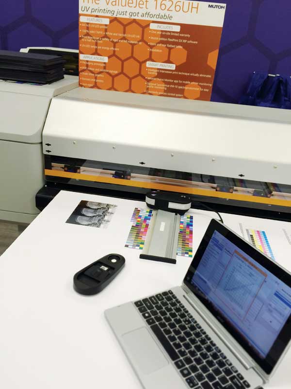
For these reasons, the best option for ensuring a common visual appearance across various printing platforms is to develop customized profiles using a sign shop’s RIP software’s own colour management capabilities, coupled with a spectrophotometer for measuring colour targets. While this is not a simple process, it can become relatively easy and repeatable with a bit of training and practice. And the return on investment (ROI) will be high, not only because it will be easier to repeat jobs for ongoing clients with more predictable and consistent results, but also because if ‘colour drift’ does occur, the sign shop will have the in-house tools to fix any problems quickly, without having to bring in outside resources.
Eyesight and colour theory
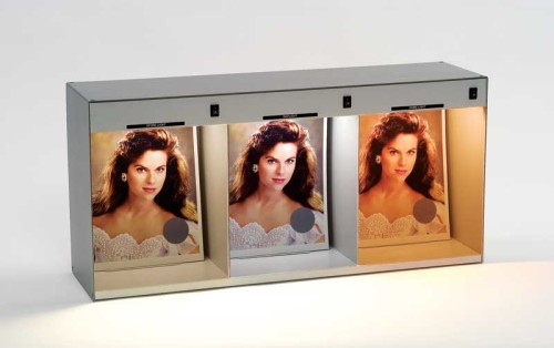
Even colour management experts know their eyes can be fooled when it comes to matching. They can become tired after a long day, just like the rest of the body, so they will perceive colours differently in the evening than in the morning.
For that matter, several forms of colour-blindness will typically affect nine to 10 per cent of men (but almost no women). Other conditions that can affect how the eyes perceive colours include ambient lighting, the surrounding colours and the physical proximity of those other colours.
There are also important differences between how computer monitors display colours and how printers output colours. On a computer screen, colours are created using an additive process. That is to say, the screen starts out black and then colours are added to it through illumination of red, green and blue (RGB) pixels. Various combinations of these three colours create the entire gamut of the display.

Sign up for our newsletter
Featuring breaking news from Canada's sign and graphics industry.
Products


Read the Latest Issue

